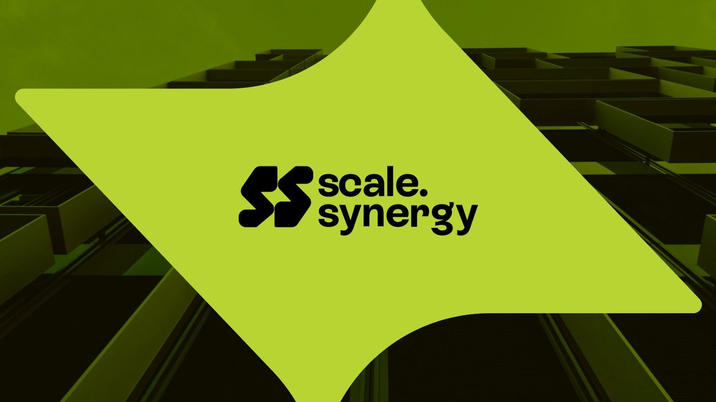
The consulting industry often struggles with a visual language problem. Most firms default to safe typography, muted palettes, and identities that prioritise respectability over personality. This approach makes them look like they belong, but it rarely allows them to stand out. ScaleSynergy, a business growth consultancy with deep international experience and a sharp focus on the South African market, needed something different.
ScaleSynergy builds tailored ecosystems for startups, SMEs, and affiliated enterprises. It helps founders navigate challenges that stall early-stage growth, including marketing, financing, recruitment, and operational structure. The consultancy's work goes beyond strategy decks; it's hands-on, guiding businesses from inception toward industry leadership within defined timeframes. To reflect this energy, the brand identity needed to carry the same vitality.
The logo was created from the brand's initials. Two stylised S forms interlock to form a single unified symbol, constructed with angular geometry and softened curves at the edges. The angular structure conveys precision and forward movement, while the rounded corners introduce approachability. The interlocking construction carries a deeper logic: ScaleSynergy's value lies in bringing things together — strategy and execution, local knowledge and global perspective, the ambition of a founder and the systems needed to realise it.
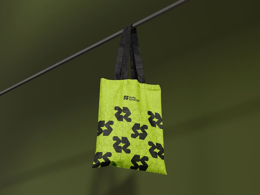
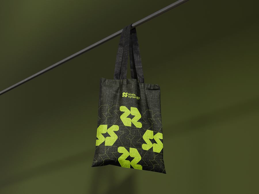
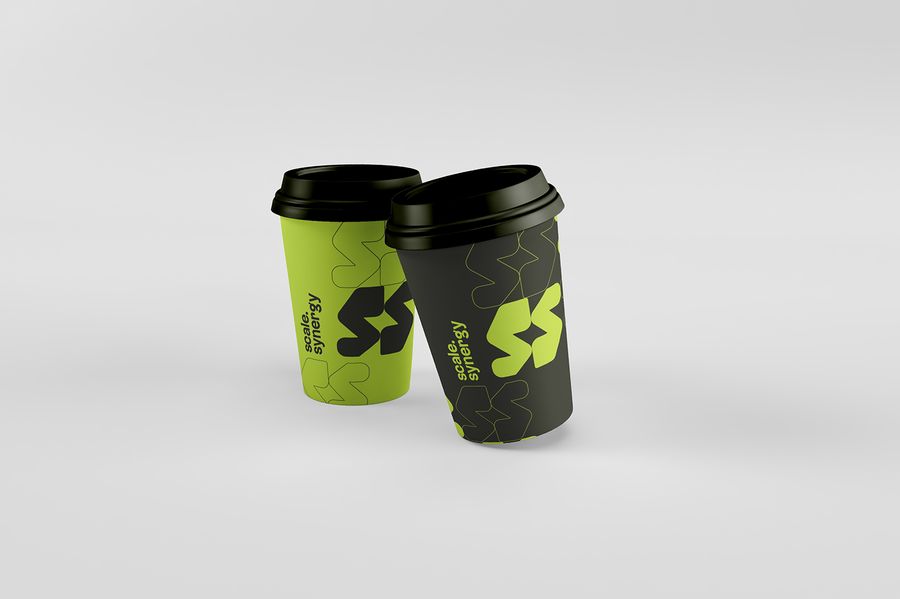
The brand pattern, derived from the logo, features interlocking S shapes tiled and rotated to create a dense, tessellating graphic that reads as both abstract texture and recognisable brand language. This system works in lime-on-dark and dark-on-lime colourways, becoming architectural at scale and subtle at smaller sizes.
ScaleSynergy now has a brand that matches its ambition. In a consulting landscape where most identities blend in, ScaleSynergy's bold, distinctive, and immediately ownable visual system stands out. The interlocking mark encapsulates the company's core proposition: bringing things together to create something greater. The lime palette ensures that the brand is impossible to overlook wherever it appears.


ScaleSynergy is a business growth consultancy with deep international experience and a sharp focus on the South African market. The company builds tailored ecosystems for startups, SMEs, and affiliated enterprises, helping them navigate the challenges that stall early-stage growth: marketing, financing, recruitment, and operational structure. Their approach goes beyond strategy. ScaleSynergy positions itself as a catalyst, providing hands-on support and expert guidance that moves businesses from inception toward industry leadership within defined timeframes.
The consulting space is visually conservative. Most firms in the category lean on safe typography, muted palettes, and identities that prioritise respectability over personality. ScaleSynergy needed something different. The brand had to signal credibility and expertise to the corporate clients it serves, but it also had to reflect the energy and ambition of the startups and entrepreneurs at the centre of its work. The identity needed to feel established enough to earn trust and dynamic enough to stand apart in a crowded field.
The mark is built from the brand's initials. Two stylised S forms interlock to create a single unified symbol, each letterform constructed with angular geometry and softened curves at the edges. The angular structure conveys precision and forward movement, while the rounded corners introduce approachability, reflecting the personality of the brand's founders and the way they work with clients.
The interlocking construction carries a deeper logic. ScaleSynergy's value lies in bringing things together: strategy and execution, local knowledge and global perspective, the ambition of a founder and the systems needed to realise it. The two S forms mirror that principle, each incomplete on its own but forming something greater in combination.
The wordmark pairs with the symbol in a stacked configuration, with "scale." and "synergy" set in a bold, condensed sans-serif that matches the mark's confident, forward-leaning energy.
Lime (#b7d433) leads the palette. It is bright, energetic, and versatile enough to perform well on both light and dark backgrounds. In a category dominated by blues, greys, and blacks, lime gives ScaleSynergy immediate visual distinction. It signals growth, optimism, and momentum, qualities that align directly with the brand's purpose.
Deep sea green (#1f2112) serves as the grounding counterpart. It absorbs the lime's vibrancy without dulling it, providing the weight and sophistication that corporate audiences expect. Off white (#f4f4f5) rounds out the palette for clean, open layouts that let the primary colours breathe.
The brand pattern was generated from the logo itself. The interlocking S forms are tiled and rotated to create a dense, tessellating graphic that reads as both abstract texture and recognisable brand language. The pattern works in two primary colourways: lime on dark and dark on lime. At scale, it becomes architectural. At smaller sizes, it functions as a subtle surface treatment. The system gives every branded object a consistent visual DNA without relying on the logo alone.
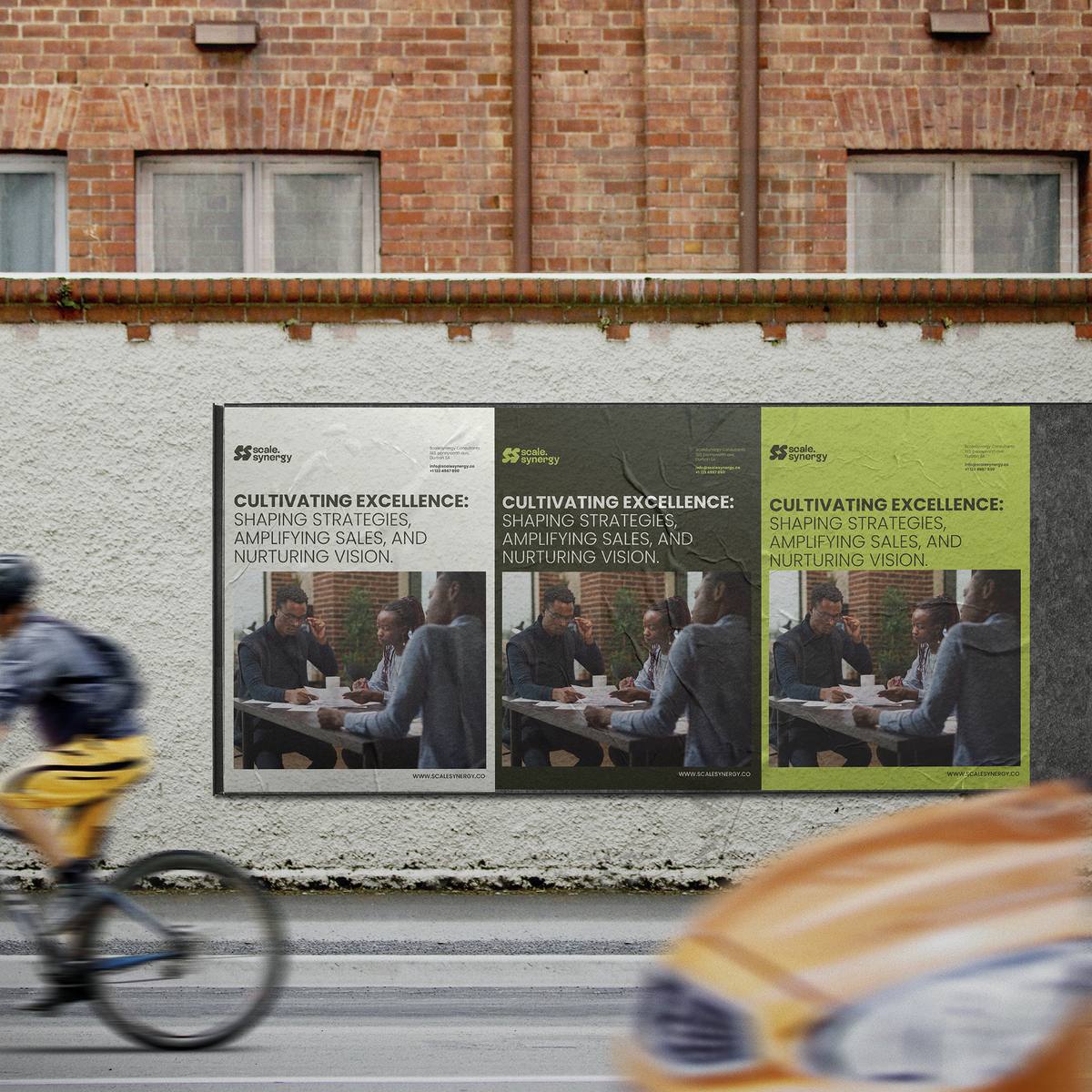
Billboard and poster applications demonstrate how the brand operates in public space. The identity is flexible enough to accommodate photography, headline copy, and the ScaleSynergy mark within a single composition, adapting across dark, olive, and lime background treatments without losing coherence.
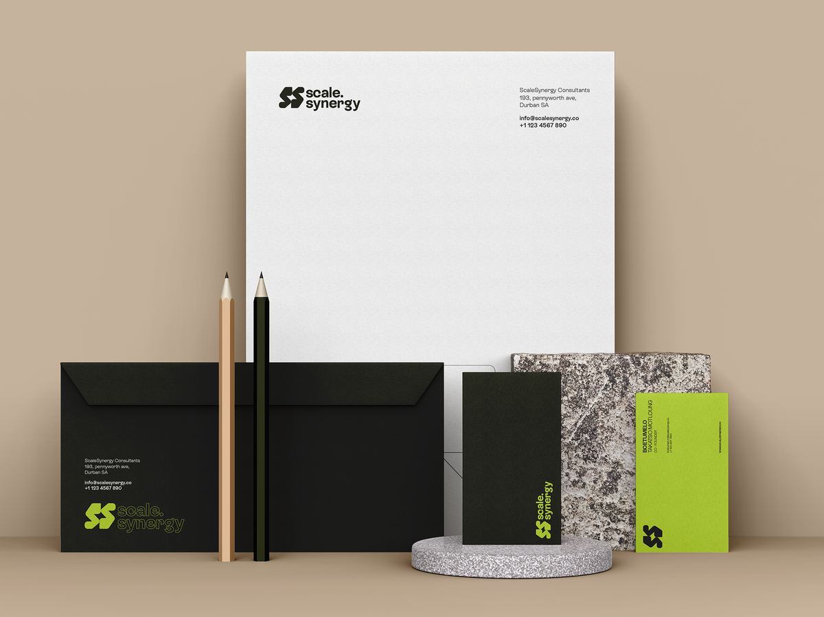
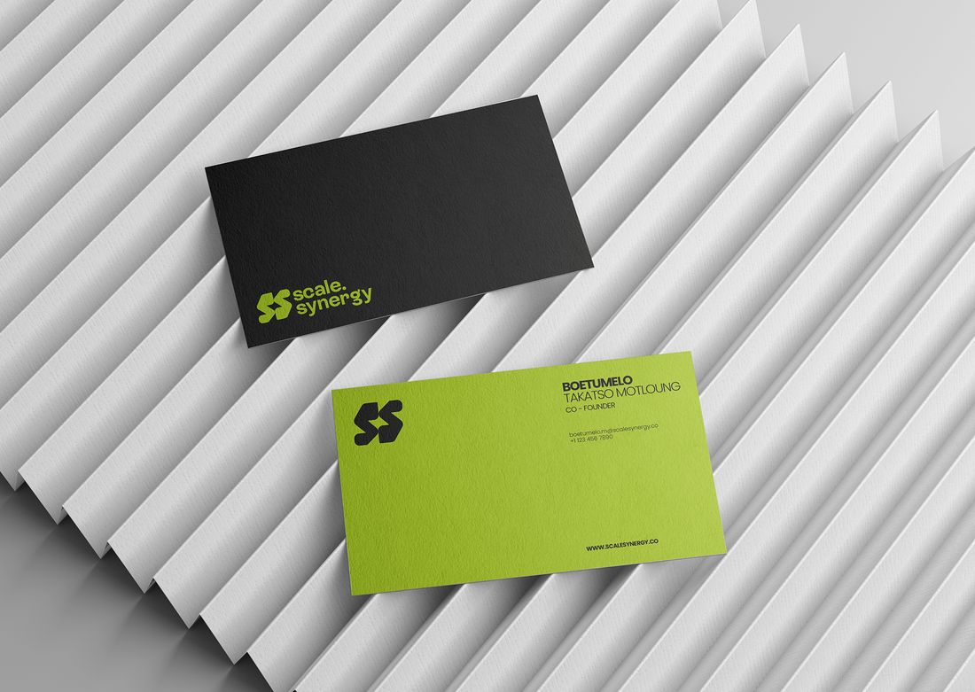
The stationery suite balances restraint with personality. Letterheads are clean and minimal, anchored by the logo and contact details. Business cards use the dark and lime colourway to create a premium feel, with the symbol on one side and full contact information on the other.
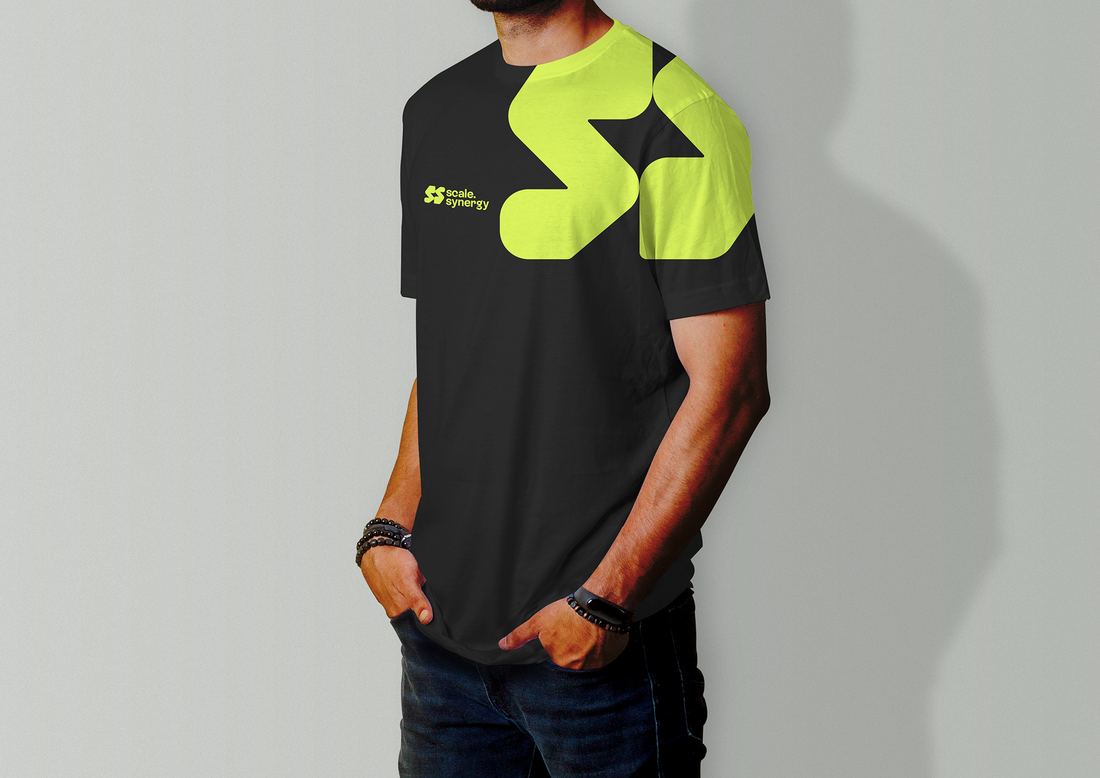
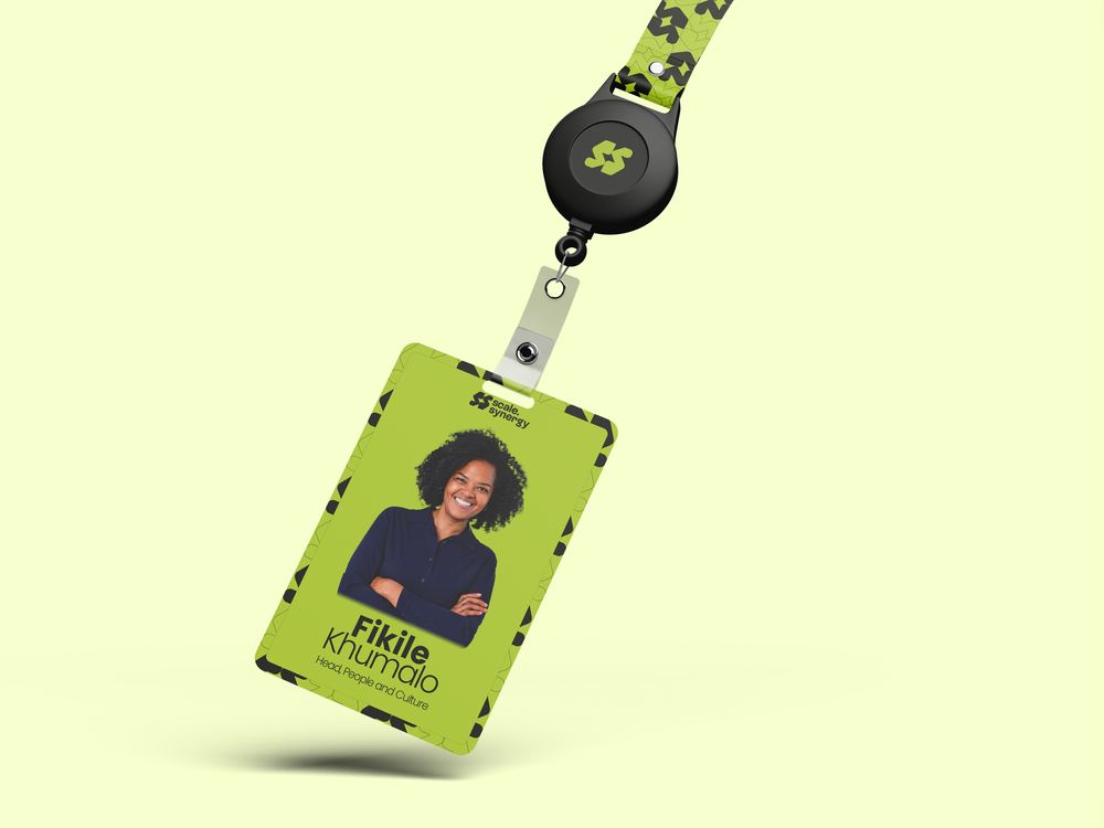
The pattern system comes alive on physical objects. Water bottles, tote bags, and coffee cups use the tessellating S pattern as the primary decorative element, creating a strong shelf presence that is unmistakably ScaleSynergy. Branded apparel features oversized symbol applications on black garments, pushing the identity into lifestyle territory. ID badges and lanyards extend the system into event and workplace contexts.
ScaleSynergy now has an identity that matches the scale of its ambition. In a consulting landscape where most brands opt for quiet respectability, ScaleSynergy's visual system is bold, distinctive, and immediately ownable. The interlocking mark captures the company's core proposition in a single gesture: bringing things together to create something greater. And the lime palette ensures that wherever the brand appears, it is impossible to overlook.