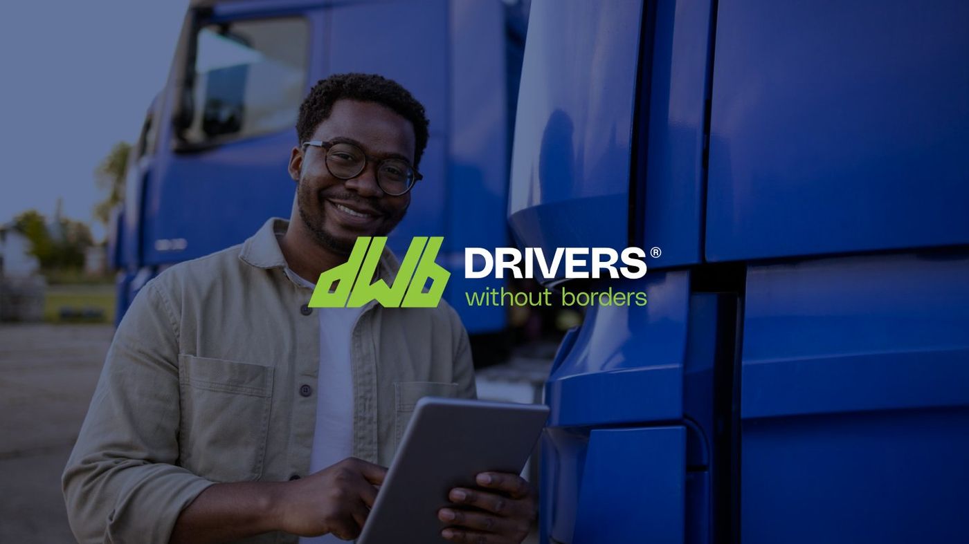
When the COVID-19 pandemic disrupted global supply chains, the logistics industry lost an estimated 40 to 50 per cent of its driver workforce. Companies needed qualified personnel, and the infrastructure for cross-border movement began to falter. Drivers Without Borders (DWB) was founded to address this gap. As a logistics manpower platform, DWB connects trained professional drivers with companies in need, sourcing talent from diverse backgrounds worldwide. However, DWB's core mission is to dismantle ethnic barriers in the logistics sector and create equal opportunity for underrepresented groups, particularly Black and ethnic minority professionals.
Developing a brand identity that served both corporate logistics clients and the drivers DWB represented was a challenge. Corporate clients required reliability, efficiency, and professionalism, while the drivers needed warmth, openness, and belonging. The visual system had to communicate with both audiences without compromising either and function across all platforms.
The concept originated with roads. Roads connect everything: enabling logistics, providing paths for travel, communities, and networks. DWB sits at the intersection of these elements: the business, the driver, and the delivery. This principle became the foundation for the entire identity.
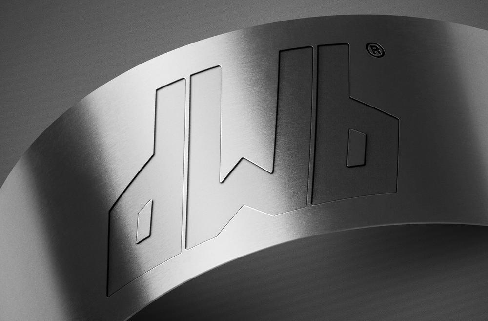
The logo, constructed from the brand's initials, features abstracted road networks forming the letters 'd', 'w', and 'b'. These intertwined shapes represent the interconnected routes defining the business and symbolise the company's mission of cultural integration, border crossing, and inclusivity. A circular badge variation extends the mark's versatility for various applications.
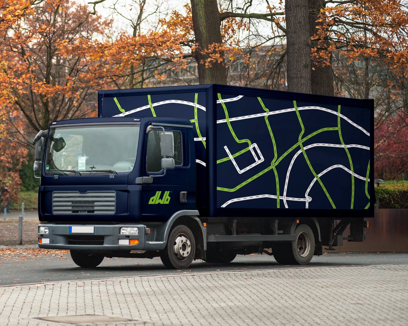
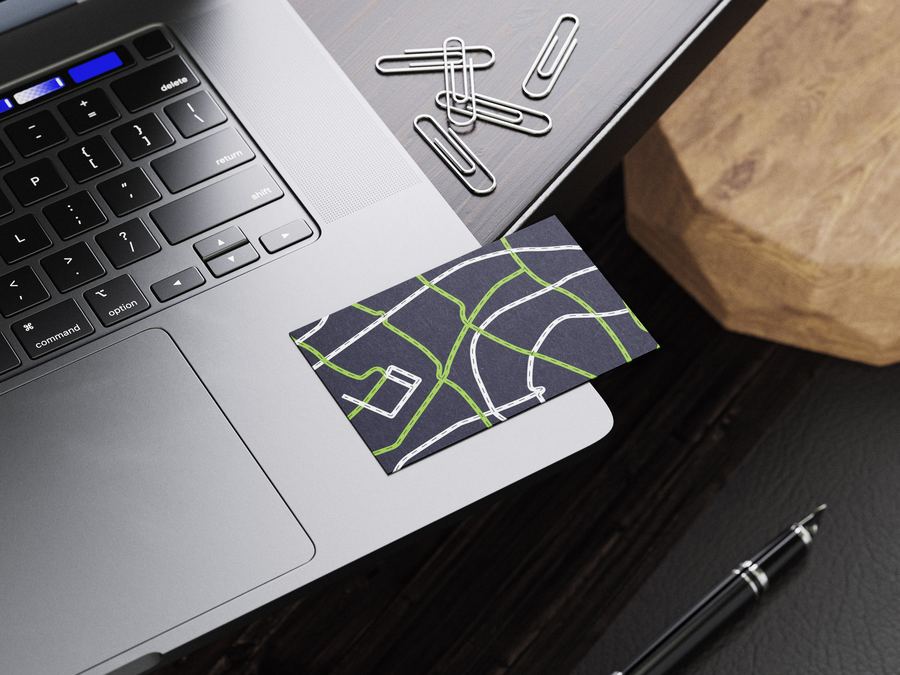
The brand pattern, drawn from the road network concept, consists of illustrated routes in lime, white, and navy, complete with dashed centre lines and intersecting paths, creating a sense of constant movement and connection. Location pins populated with diverse figures reinforce the human element at the centre of every route.
The result is a distinctive, ownable, and immediately recognisable brand identity that connects. The road-based visual system speaks to companies with authority and to drivers with warmth, with the intertwined letterforms carrying the company's values in their very structure, making the mission visible before a single word of copy is read.
Drivers Without Borders (DWB) is a logistics manpower platform built to connect trained drivers with companies that need them. Founded in response to the global driver shortage that followed the COVID-19 pandemic, when the transportation of goods and services was disrupted and the industry lost an estimated 40 to 50 percent of its logistics workforce, DWB set out to close that gap by sourcing efficient, professional, and dependable personnel from diverse backgrounds worldwide.
But DWB is not just a staffing solution. At its core, the company is driven by a commitment to equity. It exists to break down ethnic barriers in the logistics sector and provide equal opportunity to underrepresented groups, with a particular focus on Black and ethnic minority professionals. The mission is to become the foremost provider of logistics manpower services to these communities on a global scale, through a mobile and web platform that makes the connection between companies and drivers seamless.
DWB entered a crowded logistics market with an uncommon proposition: diversity and inclusion as operational pillars, not afterthoughts. The brand needed an identity that could communicate reliability, efficiency, and professionalism to corporate clients while simultaneously signalling warmth, openness, and belonging to the drivers it serves. Those two audiences have different expectations, and the visual identity had to speak to both without compromising either.
The identity also needed to work hard at a practical level. As a platform operating across borders and devices, every element of the brand system had to translate cleanly from screen to street, from a mobile app icon to a billboard on a warehouse wall.
Roads connect everything. They are the infrastructure that makes logistics possible, but they are also a metaphor for the paths people travel, the communities they cross through, and the networks they build along the way. DWB sits at the intersection of all of it: the business, the driver, and the delivery.
That idea became the foundation for the entire identity system.
The mark was built from the brand's own initials. The letters "d," "w," and "b" were constructed from abstracted road networks, each form intertwining with the next to spell out the name while simultaneously visualising the interconnected routes that define the business. The intertwined structure carries a second layer of meaning: it represents the bringing together of cultures, the crossing of borders, and the embrace of inclusiveness that sits at the heart of the company's mission.
The result is a symbol that reads as both a wordmark and an icon. It is immediately legible at scale and retains its clarity when reduced for digital applications. A circular badge variation, with the full company name wrapping the mark, extends its versatility for stamps, signage, and secondary placements.
The palette is built on two colours that work in deliberate tension. Lime (#94C841) leads the identity. It was chosen for its brightness and its connection to the natural world. Drawn from nature's green, it gives the brand an inclusive and welcoming energy, a colour that feels open and alive rather than corporate and closed off.
Navy blue (#0F1C38) serves as the counterbalance. Where lime pushes forward, navy holds steady. It calms the vibrancy without dulling it, providing the weight and authority that logistics clients expect. Together, they set a tone that is youthful and confident, professional without being rigid.
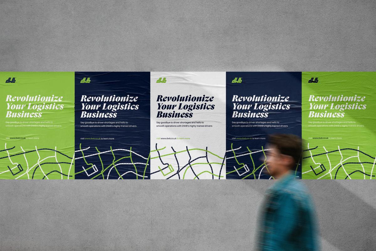
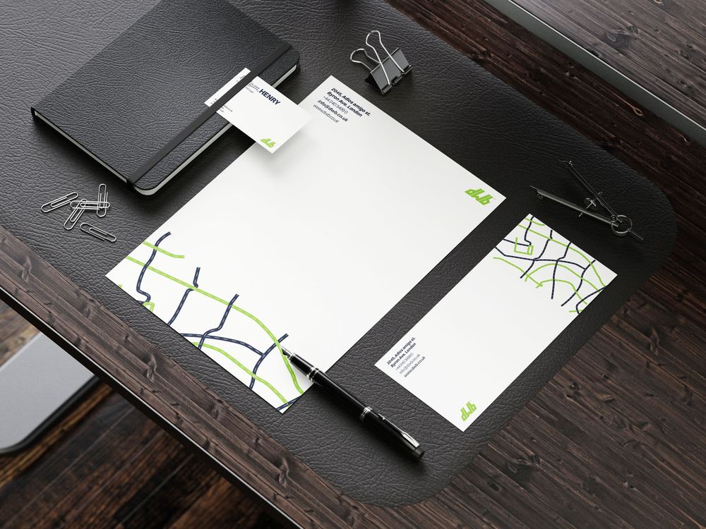
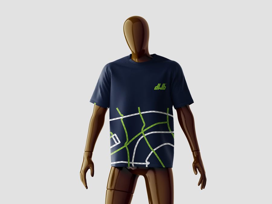
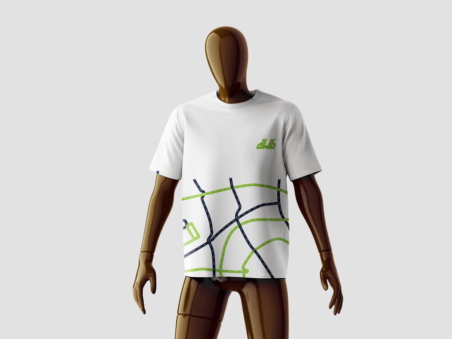
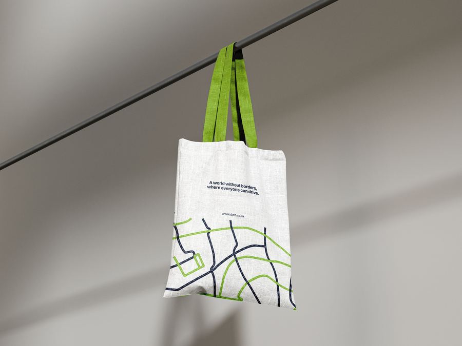
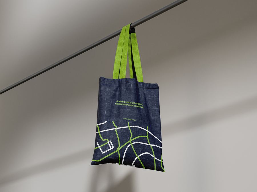
Roads link everything together. That principle extended naturally into the brand's graphic language. The pattern system is built from illustrated road networks, rendered in lime, white, and navy, with dashed centre lines and intersecting paths that create a sense of constant movement and connection. The patterns adapt across colourways, working on both dark and light backgrounds, and scale from small details on business cards to full-bleed applications on apparel and signage.
The road network motif also features location pins populated with diverse figures, reinforcing the human element at the centre of every route and every delivery.
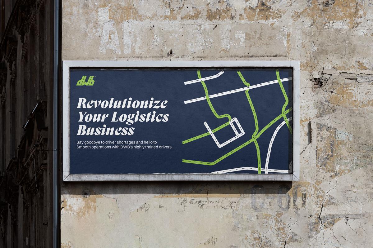
The outdoor advertising brings the identity to street level. Bold italic headlines sit alongside the road pattern, with the DWB mark anchoring the top corner. The system works in both lime-on-navy and navy-on-lime configurations, giving the brand presence in any environment.
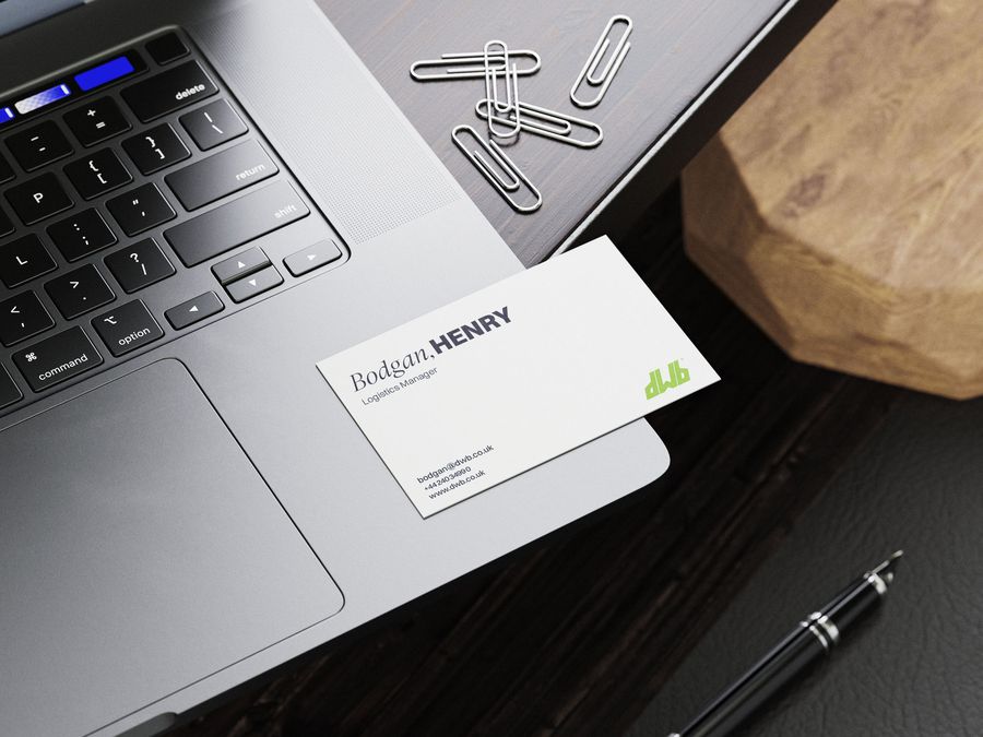
The stationery suite applies the road pattern as a subtle background texture on letterheads and as a full-bleed graphic on business card backs. The front stays clean: name, title, contact details, and the DWB mark. The contrast between the structured front and the expressive back reflects the brand's balance of professionalism and personality.
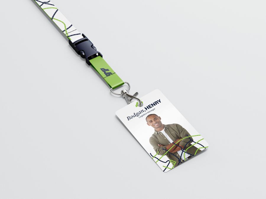
Branded t-shirts, lanyards, and ID badges demonstrate how the identity scales into workplace and event contexts. The road pattern wraps across garments as an oversized graphic, while the ID system uses the pattern more subtly, framing employee information with the brand's visual language.
DWB now has a brand identity that does what its business does: it connects. The road-based visual system gives the brand a distinctive language that is ownable, scalable, and immediately recognisable. It speaks to logistics companies with the authority they expect, and it speaks to drivers with the warmth and inclusivity they deserve.
The intertwined letterforms carry the company's values in their very structure, making the mission visible before a single word of copy is read.