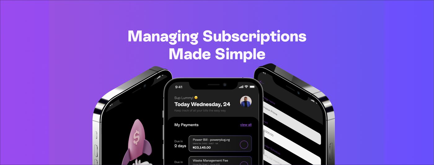
Subscriptions accumulate quietly. A streaming service here, a productivity tool there, a utility bill on a different cycle, and suddenly a person is managing ten or fifteen recurring payments across different platforms, cards, and billing dates. Most people have no system for it. They pay as things come and discover charges only after the money has left their account. The result is unexpected deductions, lapsed services, wasted spend on forgotten renewals, and a low-grade financial stress that never fully goes away.
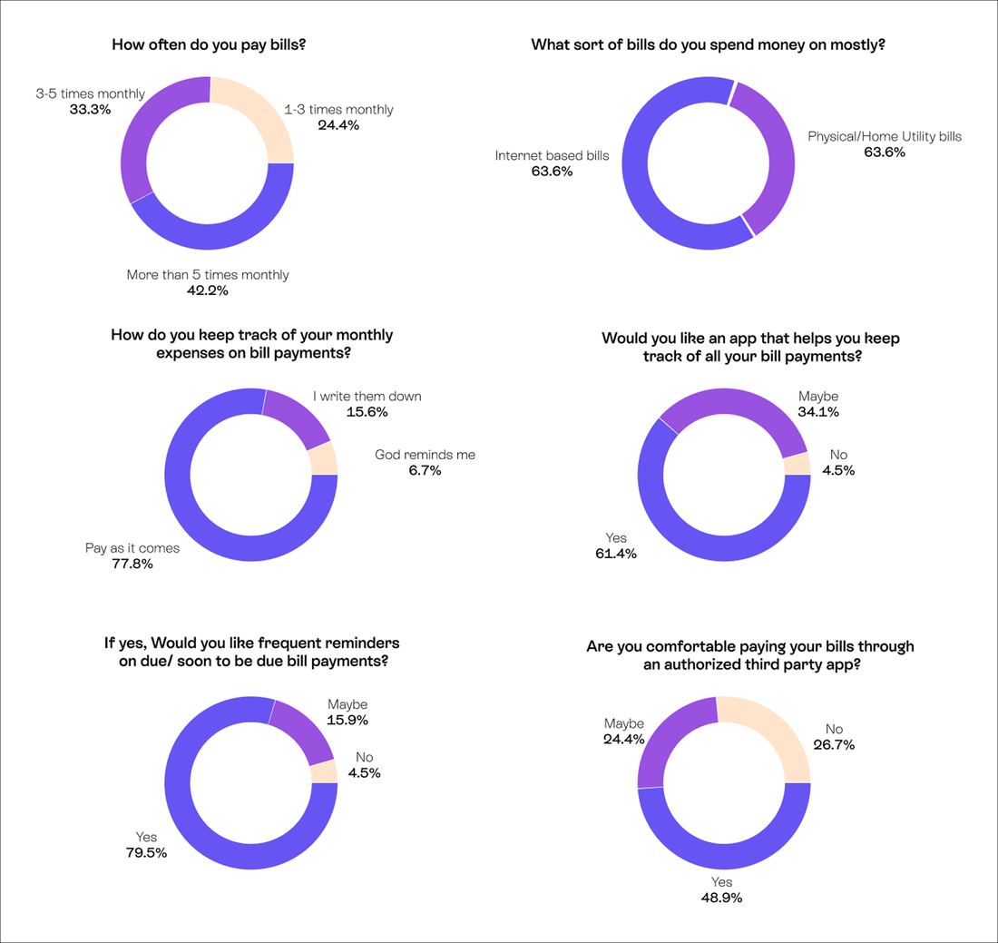
A survey of over 40 respondents confirmed the problem's shape. More than 42 percent pay bills over five times a month. Nearly 78 percent have no tracking system at all. Over 61 percent want an app that manages bill payments, and almost 80 percent want frequent reminders before charges hit. The critical insight was clear: users want structure and alerts, not another fintech dashboard.
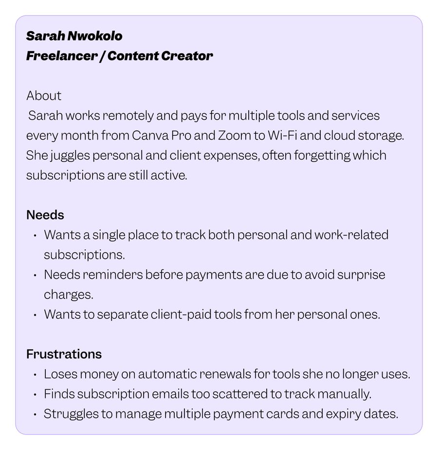
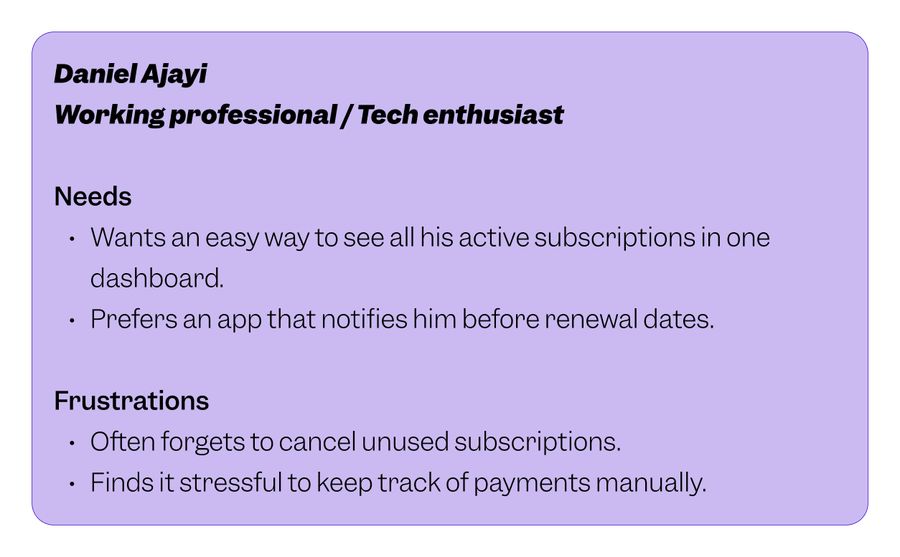
Two personas grounded the design. Sarah, a freelance content creator juggling personal and client subscriptions across multiple cards, needs separation and visibility. Daniel, a working professional overwhelmed by a growing stack of digital services, needs a single dashboard and reliable notifications. His journey was mapped across four stages, and the most important finding was about timing: if reminders arrive late, the product's entire value collapses.
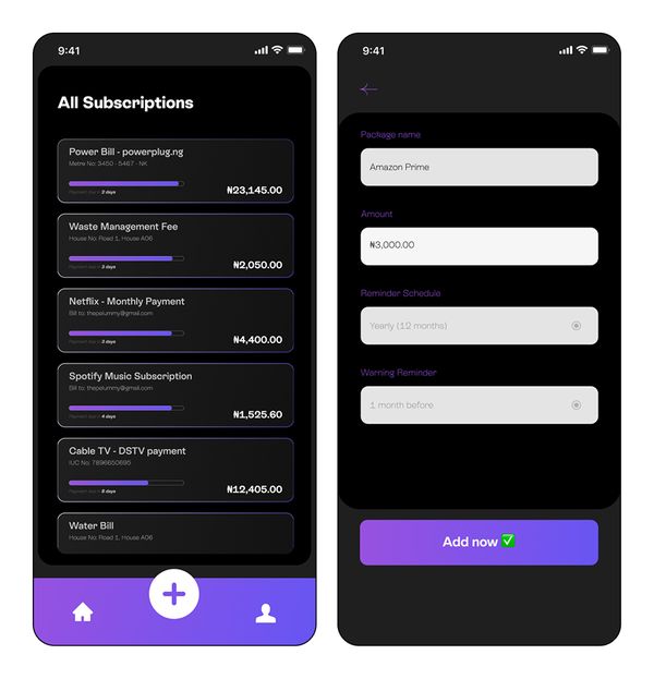
The interface is built on a dark theme with purple accents, feeling sleek and contemporary rather than clinical. Navigation is reduced to three anchors: home, add, and profile. The dashboard opens with upcoming payments sorted by due date. Adding a subscription takes three inputs: name, amount, and date. Every feature traces directly back to a research finding, and nothing exists in the interface without a reason.
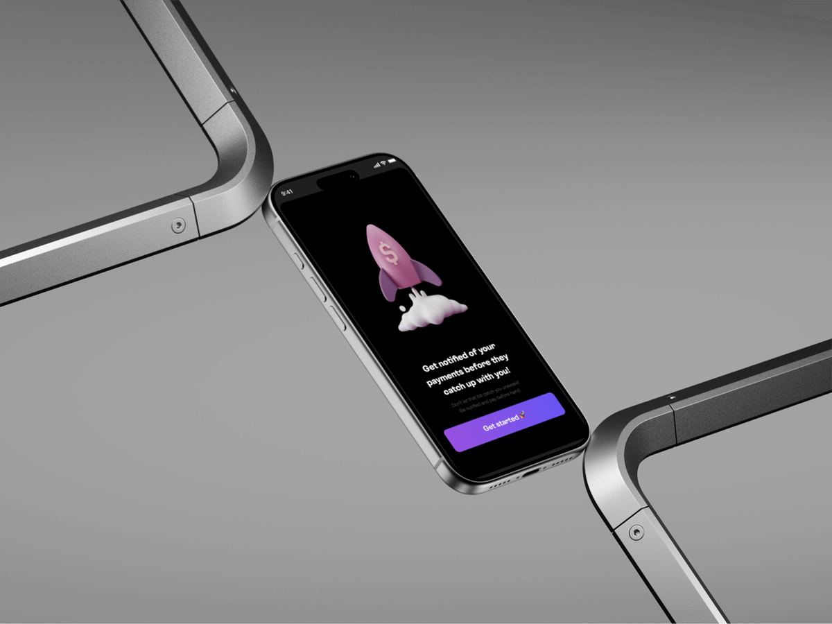
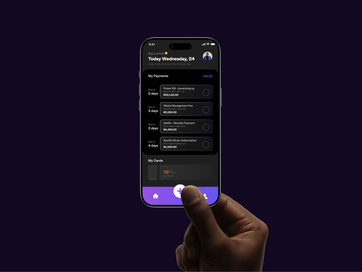
Payoo+ is a mobile application designed to help users keep track of their subscriptions and recurring payments. From digital services like Netflix, Spotify, and cloud storage to physical commitments like gym memberships, cable TV, and utility bills, the app provides a single place to manually add subscriptions, monitor their due dates, and receive timely reminders before payments catch up with you.
Subscriptions accumulate quietly. A streaming service here, a productivity tool there, a utility bill on a different cycle, and suddenly a person is managing five, ten, or fifteen recurring payments across different platforms, payment methods, and billing dates. Most people do not keep proper records. They pay bills as they come, often discovering charges only when the money has already left their account.
The consequences are real: unexpected deductions, lapsed services, money lost on renewals for tools no longer in use, and a low-grade stress that sits in the background of every month.
The goal was to design an app that consolidates all subscriptions and recurring payments into one manageable view, sends timely reminders before payments are due, and delivers the experience with enough simplicity and transparency that it never feels like a traditional financial product. Payoo+ was not meant to be another fintech dashboard. It was meant to be a personal organiser that happens to deal with money.
A questionnaire was distributed to understand how people actually manage their bills and subscriptions. The survey received over 40 responses, and the findings painted a clear picture of the problem's scale and nature.
Over 42 percent of respondents pay bills more than five times a month. Nearly 64 percent spend primarily on internet-based or utility bills. A striking 78 percent said they have no system at all. When asked whether they would use a dedicated tracking app, over 61 percent said yes. Almost 80 percent wanted frequent reminders for upcoming bills.
Sarah Nwokolo is a freelance content creator who works remotely and pays for multiple tools and services every month, from Canva Pro and Zoom to Wi-Fi and cloud storage. She juggles personal and client expenses, often forgetting which subscriptions are still active. She needs a single place to track both personal and work-related subscriptions, with reminders that reach her before charges hit.
Daniel Ajayi is a working professional and technology enthusiast with a growing stack of digital subscriptions. He wants to see all his active subscriptions on one screen and receive notifications before renewal dates. He regularly forgets to cancel unused subscriptions and finds it draining to keep track of payments manually.
Daniel's journey was mapped across four stages: awareness, onboarding, usage, and renewal. The journey begins when Daniel realises he keeps missing renewal dates. At onboarding, Payoo+ addresses this with a simple three-step process for adding subscriptions. During usage, the dashboard shows all subscriptions with statuses and due dates in a single scrollable view. At renewal, push and email notifications arrive before due dates.
The most important finding was about timing: if reminders arrive late, the entire value proposition collapses. Notification timing became a priority design decision.
Manual subscription entry lets users add any subscription with custom details including service name, amount, billing cycle, and description. Reminder notifications are the product's most critical feature, reflecting the 80 percent of survey respondents who wanted frequent alerts. Expense overview provides a breakdown of total subscription spending. Categorisation allows users to group subscriptions by type. Security transparency gives users control over how much financial information they share.
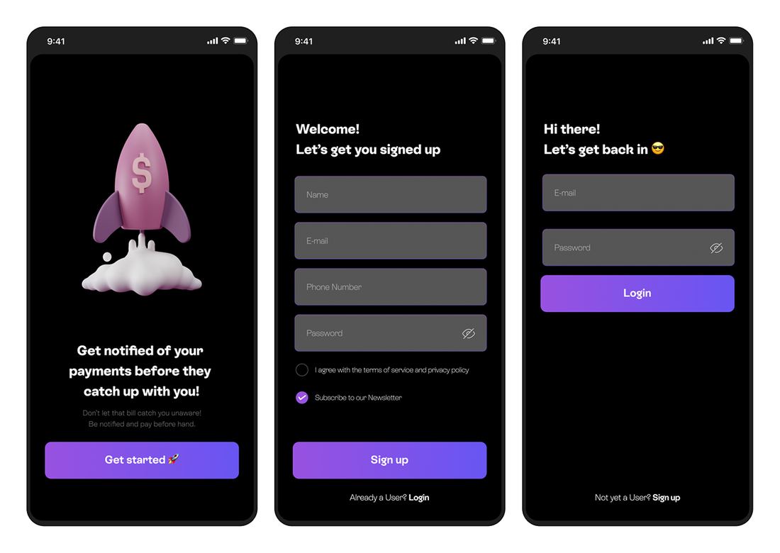
The interface was designed to feel light, approachable, and distinctly unlike a traditional finance app. A dark theme anchors the visual language, with deep blacks and charcoal greys providing a sleek, modern foundation. Purple serves as the primary accent colour, used for buttons, active states, and key interface highlights.
Every icon and text label was designed to be self-explanatory, eliminating the need for a learning curve. The bottom navigation uses three anchors: home, add subscription (centred as a prominent plus button), and profile.
A dedicated list view shows every active subscription with its name and total amount. This is the screen where the aggregate cost of recurring payments becomes visible, and for many users, it is the most revealing moment in the product experience. Adding a subscription takes three inputs: name, amount, and date.
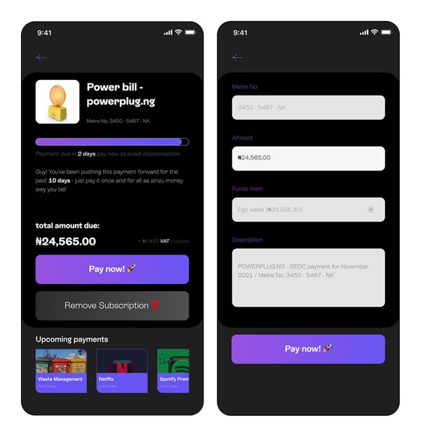
Tapping into an individual subscription reveals its full detail: service name, provider, due date, postponement history, total amount due, and upcoming payments. Two clear actions sit at the bottom: "Pay now" to settle the bill, and "Remove Subscription" to cancel tracking. The payment flow takes the user through a simple form ending with a success state that confirms the action.
The research confirmed and the design delivered on a focused premise: users value reminders and simplicity over feature density. The product successfully combines both, allowing users to feel in control of their recurring payments without confusion, clutter, or the intimidation that financial interfaces typically carry.
The dark, minimal visual language gives Payoo+ a personality that stands apart from the bright, busy dashboards of conventional fintech apps. The focused feature set means every screen has a clear purpose, and nothing in the interface exists without a direct line back to a research insight or a user need.