In Nigeria, healthcare access is unevenly distributed, leaving families on tight budgets with limited options. Providers rarely communicate warmth or reliability, making it difficult for people to trust them with their health. Mitera Health, a community health insurance provider, aims to change this by creating an enabling environment for quality, affordable healthcare for everyone.
The name 'Mitera' is derived from the Greek word for mother, reflecting the brand's maternal instinct to protect, nurture, and support. However, the existing identity lacked this meaning. The rigid, difficult-to-scale logo and lack of flexibility across digital platforms, signage, merchandise, and card formats made it generic at a time when the company was preparing for public listing and needed to inspire confidence.
The brief required the mother-and-child symbol to remain, but it also needed to address the practical shortcomings of the previous mark and create a flexible system that could adapt to any medium without losing its emotional core.
The final mark combines two interlocking spiral forms to represent the brand's protective purpose. The larger shape cradles the smaller one, creating a warm and simple design that's easy to read at any scale. A modular wordmark allows 'mitera' and 'health' to be stacked or set inline, while the registered trademark symbol adds legitimacy and trust. Together, the symbol and wordmark provide a flexible framework for arrangement across formats and mediums.
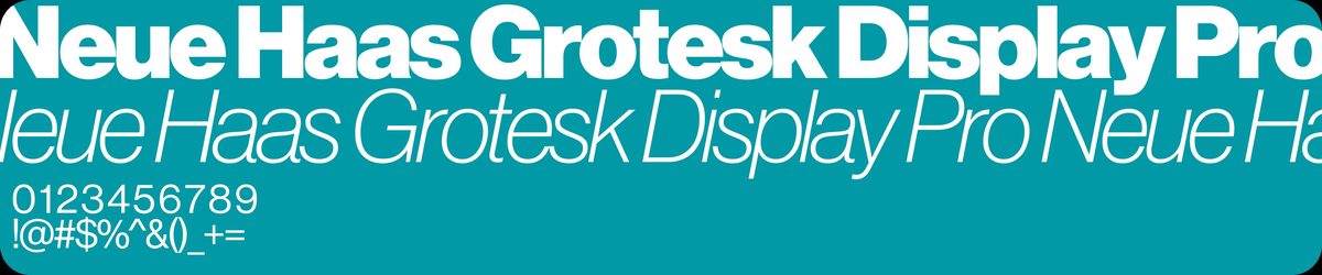
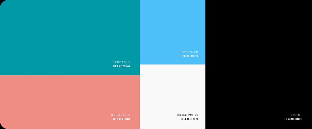
The colour palette features teal for its calm authority and to signal trust, health, and reliability. Coral adds warmth and humanity, softening the clinical edge of healthcare brands. Sky blue brings lightness and optimism, while light grey and black provide clean contrast and grounding. The typeface, Neue Haas Grotesk Display Pro, is chosen for its clarity and quiet confidence, ensuring consistent readability at headline and smaller sizes.
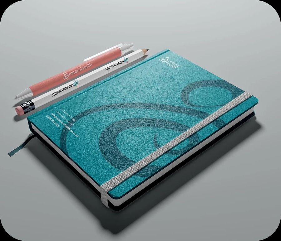
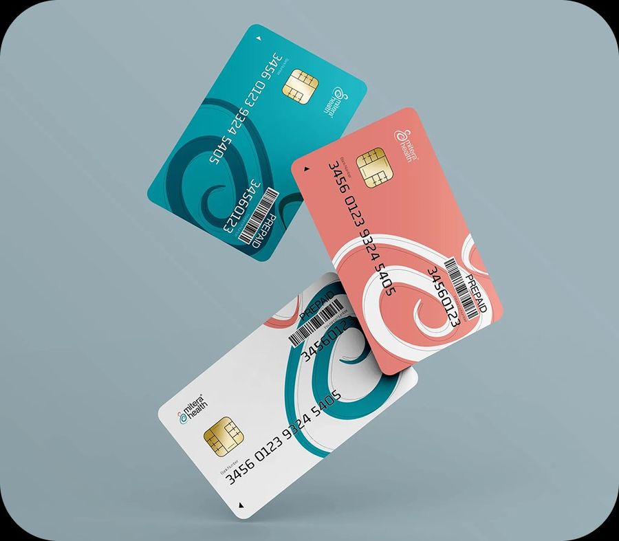
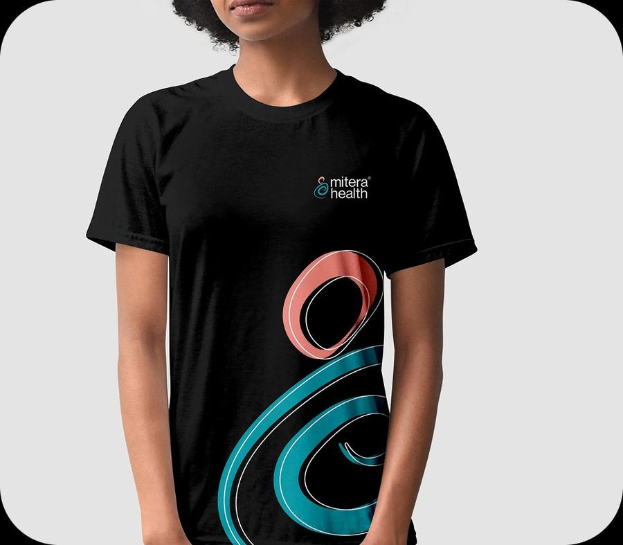
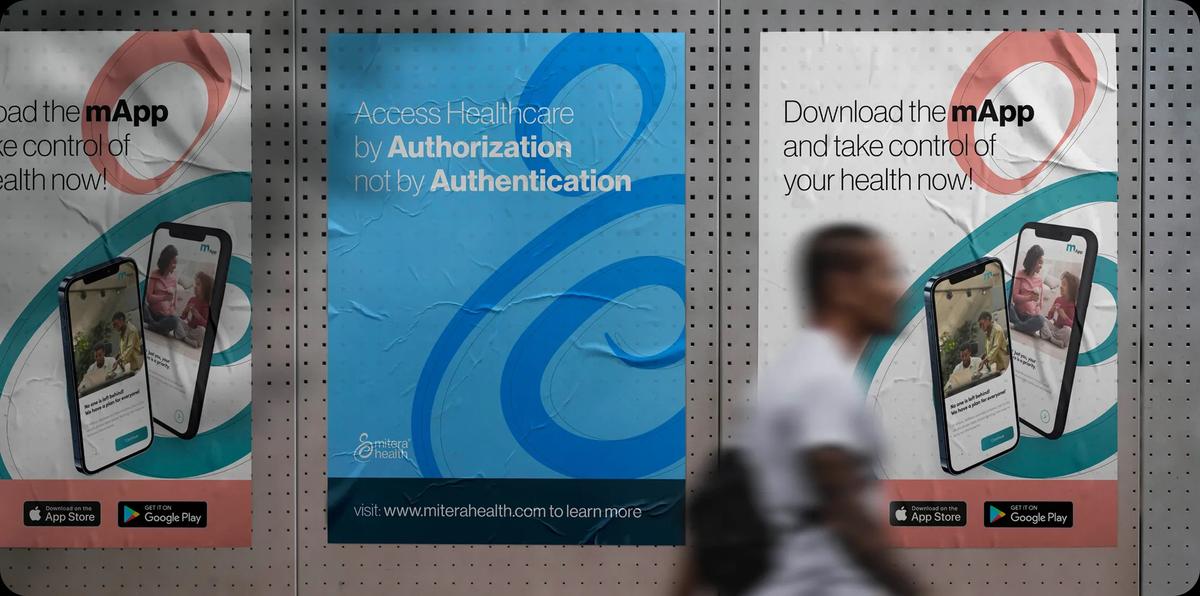
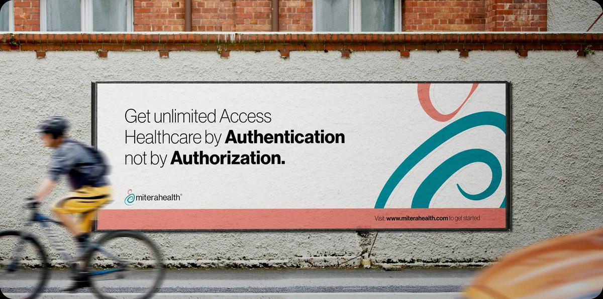
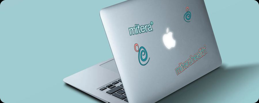
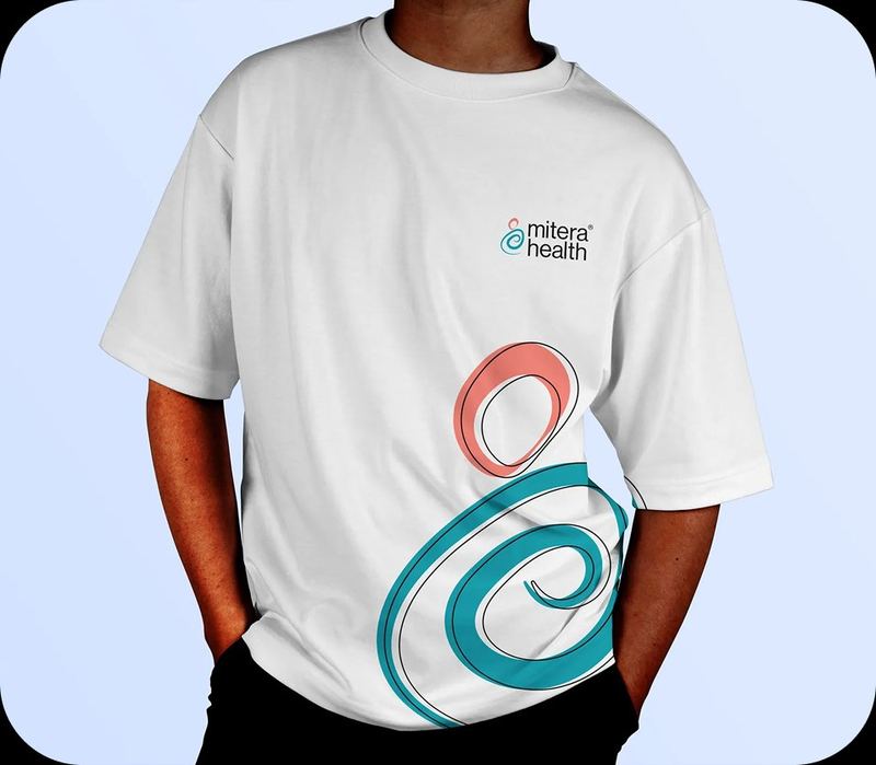
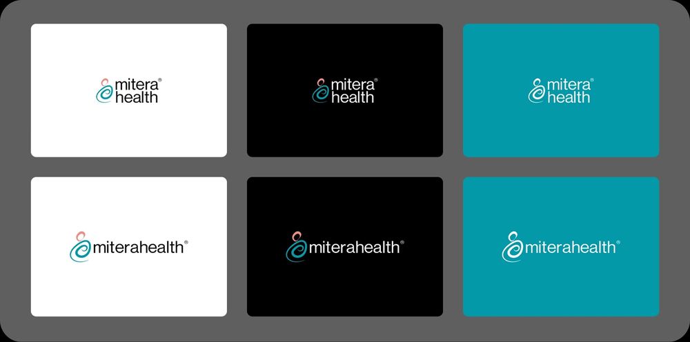
The logo was stress-tested across various backgrounds to ensure legibility, balance, and visual impact in real-world scenarios. The system was then extended to physical and digital applications. Prepaid health cards feature the spiral motif in teal, coral, and white, while the stationery suite transforms it into a textural element. Apparel and accessories use the graphic as an oversized print or embroidered mark. Water bottles, tote bags, laptop stickers, and billboard advertising confirm the design system's scalability.
The rebrand gave Mitera Health an identity that matches its ambition. It's flexible enough for a prepaid card and bold enough for a billboard. It's trustworthy without being sterile and caring without being sentimental. For a family weighing their healthcare options, the first impression a brand makes can be crucial. Mitera now meets them with the assurance they seek.




Mitera Health was founded on a simple belief: quality healthcare should not be a privilege. As a community health insurance provider in Nigeria, the company set out to serve individuals and families on tight budgets, building systems that make affordable care accessible to everyone.
The name "Mitera" draws from the Greek word for mother. That maternal instinct — the desire to protect, to nurture, to show up when it matters most — runs through everything the brand stands for.
Mitera Health had a trust problem. Not with their service, but with their image.
In the insurance sector, credibility is currency. Customers are making deeply personal decisions about their health and their families' futures. They need to feel safe before they sign up. But Mitera's existing brand identity felt generic and unpolished. The logo was rigid, difficult to scale, and lacked the warmth the company worked so hard to deliver in practice.
As the company prepared for public-facing growth, it became clear that the visual identity needed to match the quality of the service. The gap between what Mitera was and what Mitera looked like had to close.
The task was to redesign the brand identity to reflect Mitera Health's core values: active, open, flexible, accessible, and affordable. The personality had to feel caring, honest, friendly, and soft. The business owner was clear on one non-negotiable: the mother-and-child symbol had to stay — it was the soul of the brand.
The task was to honour that directive while solving the practical shortcomings of the old mark. The logo needed to work everywhere, at every size, on every surface.
The visual research centred on real moments of connection between mothers and children. Not staged or sanitised, but genuine. The mood board drew from imagery across cultures and communities, grounding the rebrand in the emotional truth at the heart of the brand: protection, closeness, and unconditional care.

The previous logo served its purpose in limited contexts, like basic stationery. But it lacked a coherent design system. It could not flex across digital platforms, merchandise, signage, or card formats without losing clarity or feeling awkward. A more dynamic, versatile identity was overdue.
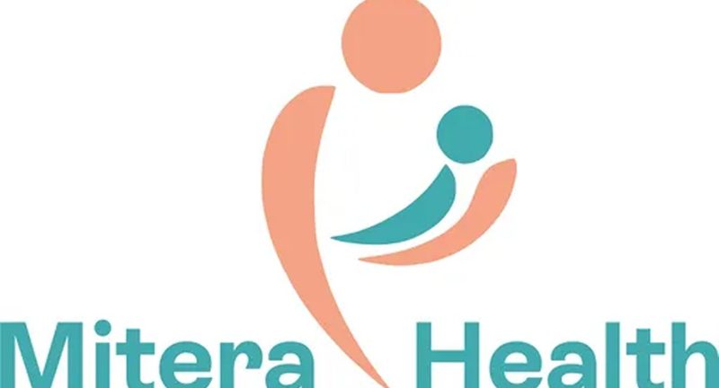
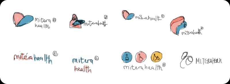
Exploration began on paper. Dozens of directions were sketched, each attempting to distil the mother-and-child relationship into a single, fluid mark. The goal was to find a shape that felt organic and human while remaining clean enough to function as a modern logo system.
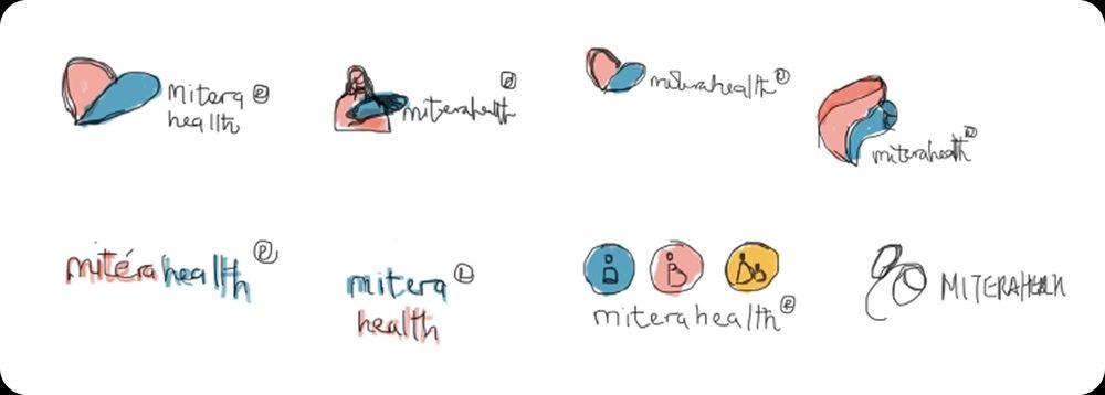
The final mark abstracts the mother-and-child embrace into two interlocking spiral forms. The larger shape cradles the smaller one, echoing the protective gesture that defines the brand's purpose. It is warm without being literal, and simple enough to read at any scale.
Three components work together: The Symbol captures the caring, nurturing nature of the brand through the abstracted mother-and-child motif — it is the emotional anchor of the identity. The Wordmark was designed to be modular — "mitera" and "health" can be stacked or set inline, adapting to context without losing recognition. The registered trademark symbol reinforces legitimacy and trust. The System brings both elements together in a flexible framework, with clear rules for arrangement across different formats and mediums.
The palette balances professionalism with approachability: Teal (#0299A7) anchors the brand with calm authority, signalling trust, health, and reliability. Coral (#EF8D84) adds warmth and humanity, softening the clinical associations of healthcare. Sky Blue (#4EC0F9) introduces lightness and optimism. Light Grey (#F9F9F9) and Black (#000000) provide clean contrast and grounding.
The typeface, Neue Haas Grotesk Display Pro, was chosen for its clarity and quiet confidence. It reads well at headline scale and holds up in smaller applications, giving the brand a consistent voice across all touchpoints.
The logo was stress-tested across light, dark, and brand-coloured backgrounds in both stacked and inline configurations. Every combination was evaluated for legibility, balance, and visual impact — to ensure the identity holds up in real-world conditions, not just in a design file.
The rebrand gave Mitera Health an identity that finally matches its ambition. The new system is flexible enough to work on a prepaid card and bold enough to command a billboard. It feels trustworthy without being sterile, and caring without being sentimental.
Most importantly, it bridges the gap between the company's values and the first impression it makes. For a family weighing their healthcare options, that first impression can make all the difference.