
Dating apps have a trust problem, and most of them have stopped trying to fix it. Platforms either leave access wide open or rely on surface-level safeguards like IP tracking and phone number verification that anyone with an internet connection can bypass. The result is an experience where fake profiles, catfishing, and spam accounts are treated as inevitable. Users have learned to approach every match with suspicion rather than excitement. Dat'n was built to change that.
The core design challenge was building identity verification into the product so naturally that it felt like a feature rather than a barrier. Most platforms bolt verification on after account creation, if they include it at all. Dat'n inverts that logic. The onboarding flow collects all required information upfront, including government-issued ID or live selfie verification, so that by the time a user reaches the main experience, every feature is unlocked and every profile they encounter belongs to a verified individual.
The process moved through user flow mapping, paper wireframes, and iterative prototyping before reaching high-fidelity screens. The visual identity pairs ochre yellow with deep red and green accents, creating a palette that feels warm and inviting without losing sophistication. Ragasta handles display type with editorial elegance while Open Sans provides clarity for body text and forms.
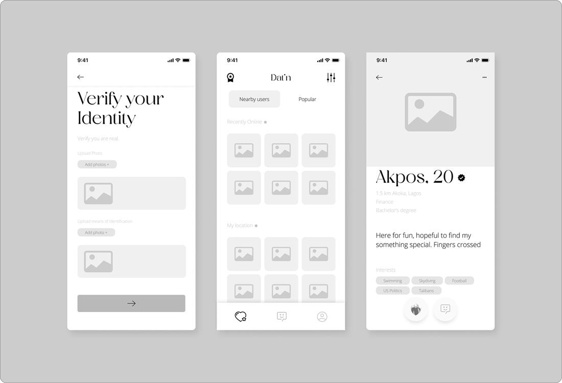
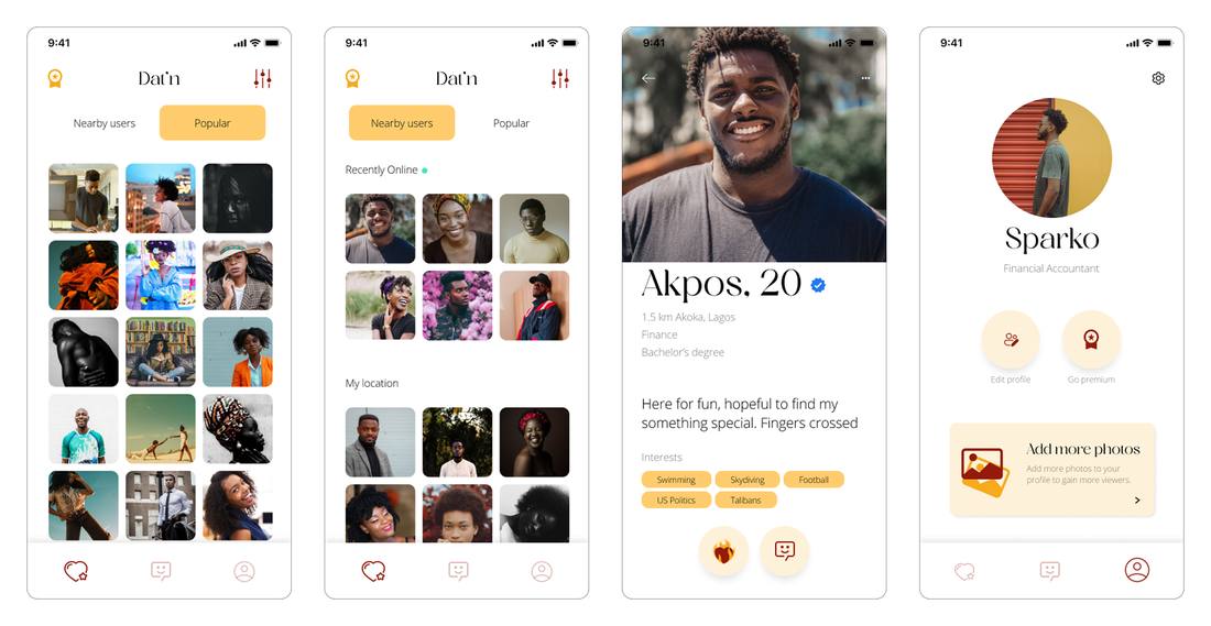
The dashboard splits discovery into Nearby and Popular tabs with a Recently Online row for active profiles. Full profile cards surface enough information for genuine decisions: photos, age, location, occupation, education, bio, and interest tags alongside the verification badge. Messaging is clean and conversation-first. Settings give users full control over visibility, distance, notifications, and account management.
The result is a dating app that treats trust as a design problem, not a moderation afterthought. Every profile is verified. Every match starts with transparency. And the experience stays focused on what it should be about: meeting someone real.
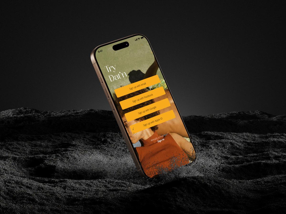
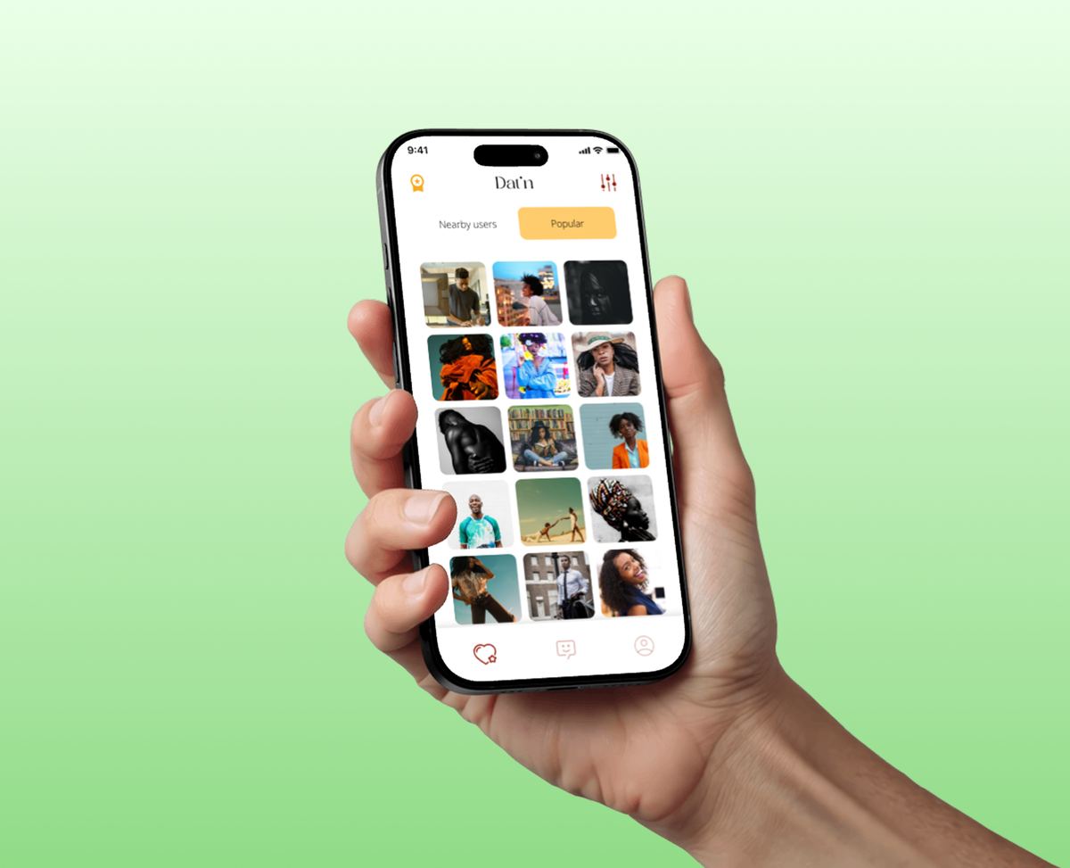



Dat'n is a dating application designed around a single conviction: people should not have to wonder whether the person they are talking to is real. The platform allows users to create detailed profiles, browse nearby and popular matches, communicate through in-app messaging, and arrange to meet, all within an environment where every account has been verified against a real identity.
Dating apps have a trust problem. Most platforms take one of two approaches to account security: they either leave access wide open, or they layer on surface-level safeguards like IP tracking and phone number verification that are easy to bypass. The result is an ecosystem where fake profiles, catfishing, and spam accounts are accepted as an unavoidable cost of the experience.
The primary challenge for this project was designing a system capable of identifying and filtering out fraudulent accounts during setup, before they ever reach another user's feed.
The product needed to achieve five things: make sign-up effortless, catch fake accounts at the point of creation, remove the burden of filtering spam from the user's experience, keep every interaction intuitive and flexible, and give users full transparency about the person they are engaging with. The aim was not to add friction for the sake of security, but to build verification into the experience so naturally that it became a feature rather than a barrier.
Most dating platforms treat verification as an afterthought, something bolted on after account creation. Dat'n inverts that logic. The onboarding flow was designed to collect all required profile information upfront, including identity verification, so that once a user reaches the main experience, every feature is available to them without interruption.
The verification system itself goes beyond the usual methods. Each user is required to submit a government-issued identity document: a passport, driver's licence, or national ID card. For cases where document verification cannot be completed immediately, a live selfie or video verification serves as an alternative pathway.
This front-loaded approach also serves a design purpose. By gathering detailed personal information, interests, lifestyle preferences, and photos during onboarding rather than piecemeal over time, the app can surface richer, more complete profiles from the moment a user enters the platform. Better profiles lead to better matches, which lead to better conversations.
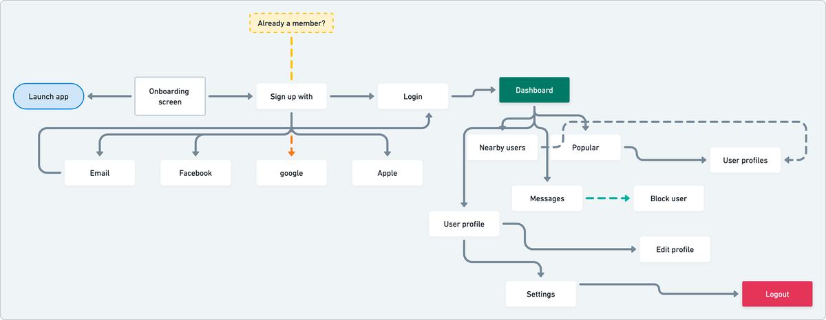
A user flow was mapped to define every path through the application: from launch and onboarding, through sign-up and login, to the dashboard where users can browse nearby and popular profiles, view individual profiles, exchange messages, block users, edit their own profile, manage settings, and log out.
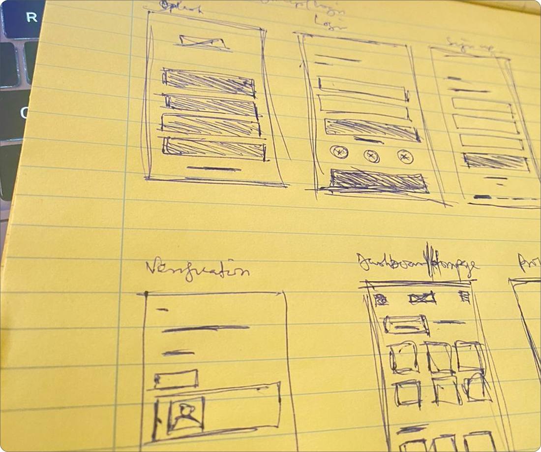
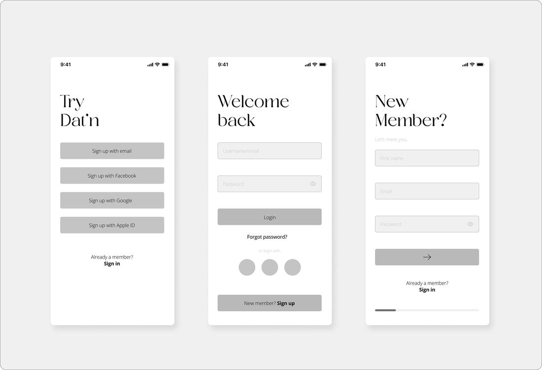
Exploration started on paper, with rough sketches establishing the structure and hierarchy for splash screens, sign-up flows, verification screens, the main dashboard, and profile views. These were then translated into digital wireframes that tested layout, spacing, and interaction patterns before any visual design was applied.
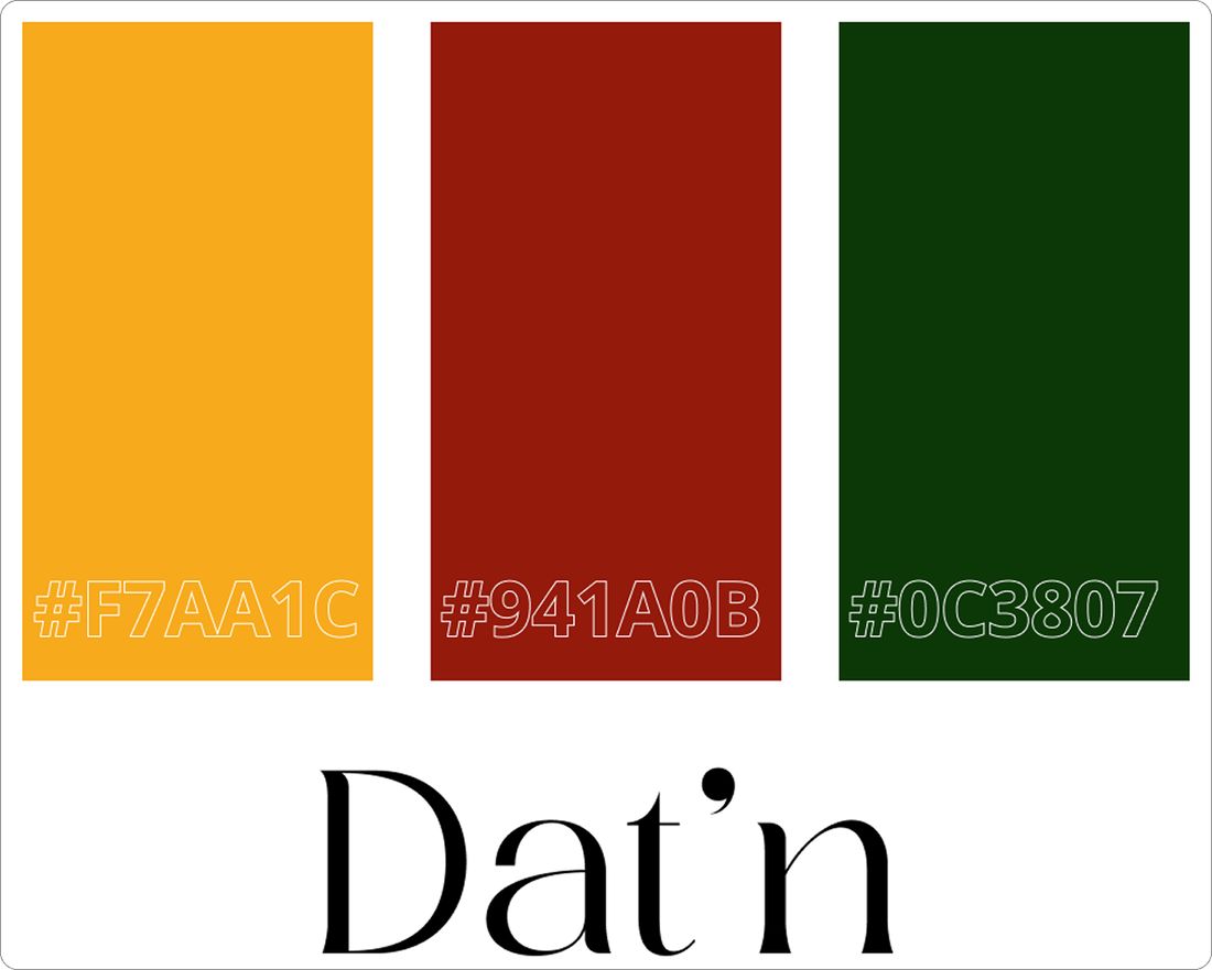
Ochre yellow (#F7AA1C) leads the identity as the primary colour, bringing warmth, energy, and a sense of optimism. A dark shade of red (#941A0B) and deep green (#153807) serve as secondary accents. Ragasta was selected as the display typeface, bringing a refined, editorial quality to headlines. Open Sans handles body text and form labels, providing clarity and neutrality.
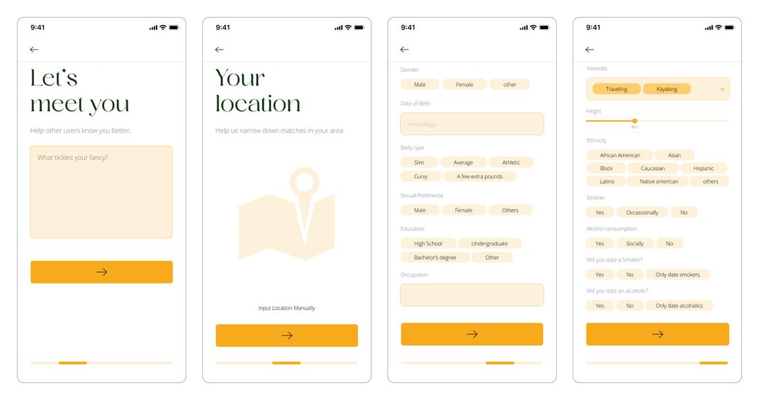
The onboarding was kept deliberately minimal. The splash screen presents the Dat'n wordmark cleanly, then transitions to a sign-up screen that offers four entry points: email, Facebook, Google, and Apple ID. The design acknowledges that most users want to get into the app as quickly as possible.
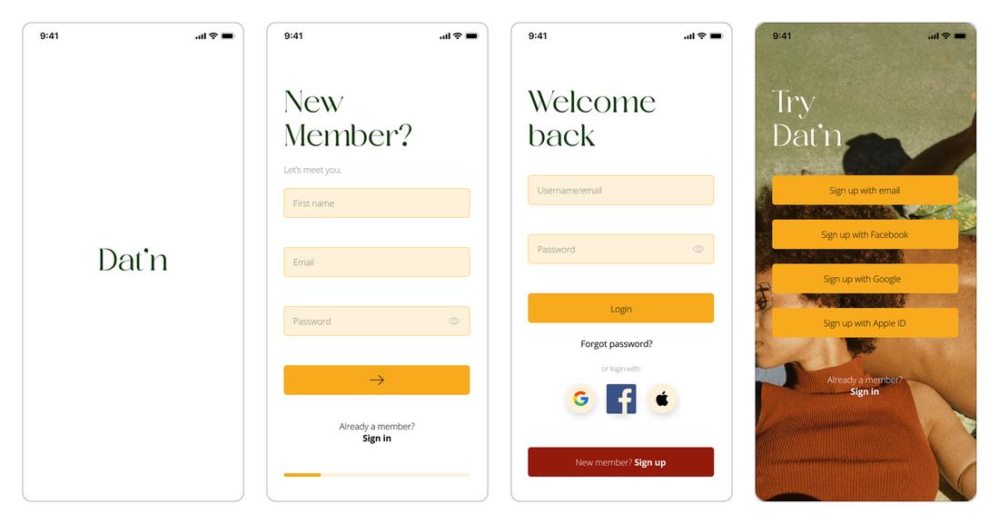
The sign-up flow captures essentials first: name, email, and password. From there, users move into profile setup, where they provide details about themselves: gender, date of birth, body type, sexual preference, education, occupation, interests, height, ethnicity, and lifestyle preferences. This information is gathered across a series of focused screens, each with a clear progress indicator.
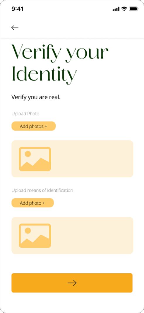
After profile setup, users are prompted to verify their identity. The screen is straightforward: upload a recent photo and a recognised means of identification. The language is direct and reassuring: "Verify you are real." Users who complete verification receive a badge on their profile, visible to everyone they interact with.
The main dashboard is split into two tabs: Nearby Users and Popular. A "Recently Online" row at the top surfaces active profiles, while the grid below displays matches based on location. Tapping a profile opens a full-view card showing the user's photo, age, location, occupation, education, bio, and interests as tag chips. A verification badge confirms their identity at a glance.
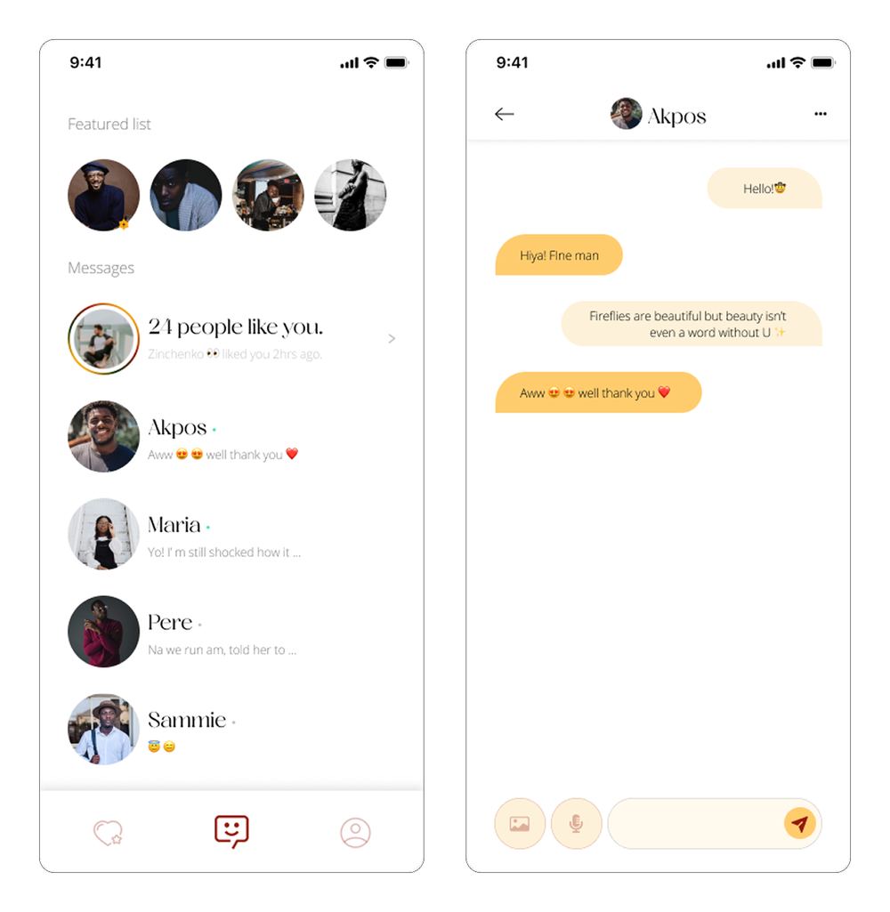
The messaging interface is clean and familiar. A featured list highlights profiles that have expressed interest, while the main message list shows active conversations with preview text and timestamps. Individual chat screens support text, emoji, and media sharing. The design avoids clutter, letting the conversation itself take centre stage.
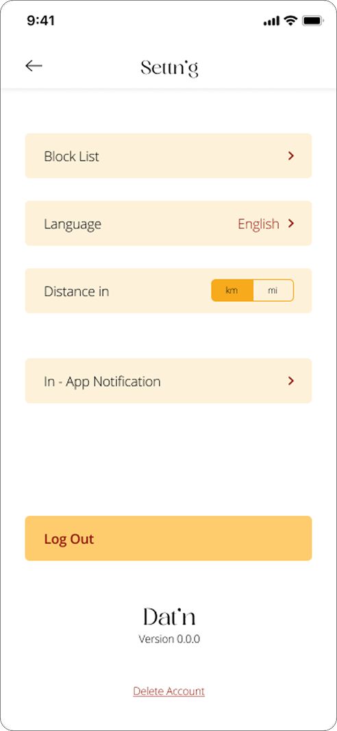
The settings screen provides access to block lists, language preferences, distance settings, and notification controls. A log out option and account deletion link are positioned clearly, giving users full control over their presence on the platform.
Dat'n is a dating app that treats trust as a design problem, not a moderation problem. By building identity verification into the core onboarding flow rather than treating it as optional or retroactive, the platform ensures that every profile a user encounters belongs to a real person. The front-loaded profile setup means richer matches from the start. The warm, editorial visual language sets a tone that feels elevated without being exclusive. And the simple, focused navigation keeps the experience about what it should be about: meeting someone real.
View Prototype →