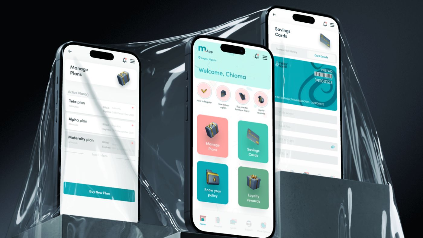
Most Nigerians believe health insurance is for the wealthy. For those who try to engage with the system, the experience reinforces that belief: manual claims processing riddled with fraud, long identification delays, caregivers without access to patient histories, and costs that feel punitive rather than protective. Mitera Health, a technology-driven healthcare organisation operating across all 36 states, already offered affordable and flexible plans. What it needed was a digital product that matched that ambition. mApp is that product.
Research began with interviews across three user groups: individual users, hospital staff, and corporate HR managers. Individual users revealed deep scepticism toward digital healthcare platforms, with trust being the primary barrier rather than price. Hospital workers were drowning in manual verification. Corporate HR teams found enrolling staff tedious and tracking coverage nearly impossible.
Two personas crystallised from the findings. Adaora, a 32-year-old corporate employee, represents the trust problem: she wants insurance that actually works when she needs it. Kunle, a 41-year-old HR manager overseeing 40 employees, represents the efficiency problem: he needs batch enrolment, coverage dashboards, and systems that do not waste his time.
The design moved through user flows, paper wireframes, and iterative prototyping before reaching high-fidelity screens. The visual language builds on Mitera Health's brand palette — teal for trust and authority, warm coral for approachability, and Sofia Pro for clarity across weights and sizes. The dashboard surfaces core actions immediately. Visual plan comparison cards address the confusion the research uncovered. Real-time COVR authentication replaces manual hospital verification. Users can schedule appointments, receive prescriptions remotely, track health records, and manage claims with push notifications at every stage.
The result is a platform that takes a traditionally cumbersome, low-trust process and makes it feel effortless. Every decision traces back to what the research revealed: the barriers to health insurance adoption in Nigeria are not just financial, they are experiential. mApp is live on the Google Play Store, the App Store, and the Huawei Store.
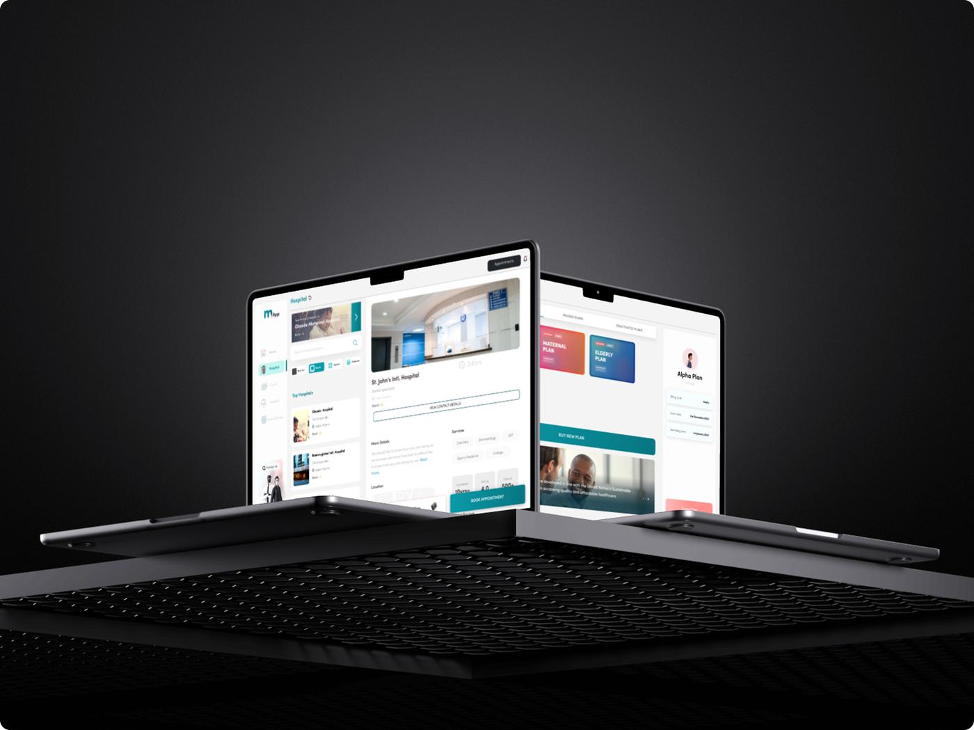
mApp is the mobile application for Mitera Health, a technology-driven healthcare organisation providing flexible, accessible, and affordable health insurance across all 36 states of Nigeria. The platform serves individuals, families, SMEs, and corporate groups, allowing them to purchase plans, select hospitals, schedule appointments, consult doctors remotely, and manage their health coverage from a single interface.
Health insurance in Nigeria carries a perception problem. Most people believe it is a service reserved for the wealthy. For those who do engage with the system, the experience reinforces that belief: manual claims processing riddled with fraud, long identification delays, caregivers without access to patient histories, and costs that feel punitive rather than protective. Trust is low, and the tools meant to build it are outdated.
With Mitera Health already offering affordable and flexible plans, the design challenge was focused on the digital experience. The product needed to simplify enrolment, make authentication seamless, protect sensitive medical data, and create a platform that felt modern enough to shift perceptions about what health insurance in Nigeria could look like.
The ambition was clear: build a system where healthcare access is determined by who you are, not by who approves you. Authentication, not authorisation.
To ground the design in reality rather than assumptions, interviews were conducted with three key user groups: individual users, hospital staff, and corporate HR managers. Each brought a different perspective on the same broken system.
Individual users revealed a deep scepticism toward digital healthcare platforms. Trust was the primary barrier, not price. Hospital workers were struggling with manual enrolee verification that was slow, error-prone, and created bottlenecks. Corporate HR teams found enrolling multiple staff members tedious and time-consuming, with little visibility into coverage status.
These conversations surfaced a consistent theme: the problem was not a lack of willingness to use health insurance. It was a lack of systems designed with enough care to earn people's confidence.
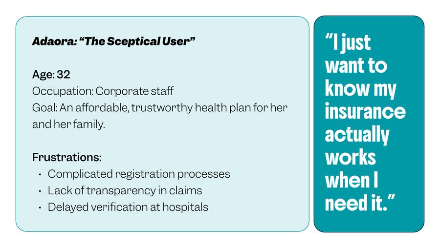
Adaora is a 32-year-old corporate employee looking for an affordable, trustworthy health plan for herself and her family. She has been burned by complicated registration processes, a lack of transparency around claims, and delayed verification at hospitals. Her frustration is simple and deeply felt: she wants to know that her insurance actually works when she needs it.
Kunle is a 41-year-old HR manager at a logistics firm responsible for managing health coverage for over 40 employees. His days are consumed by manual enrolment, poor visibility into coverage status, and communication gaps between hospitals and insurers.
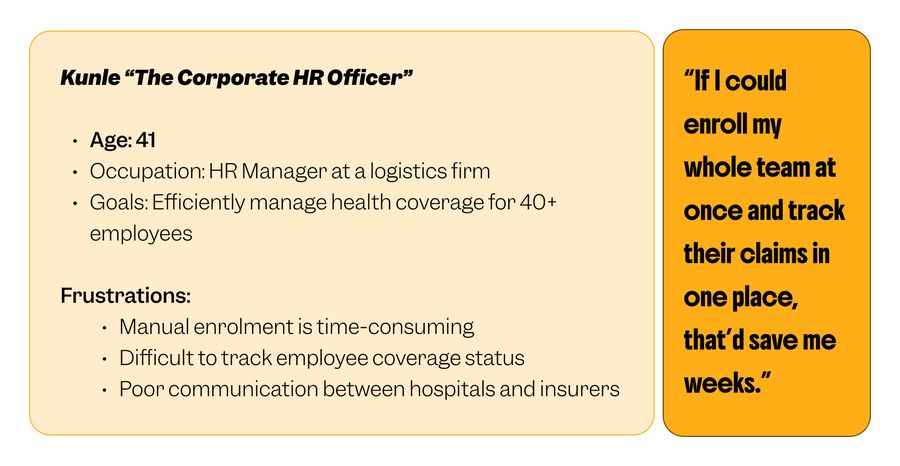
Adaora represents the trust problem. Kunle represents the efficiency problem. mApp needed to solve both.
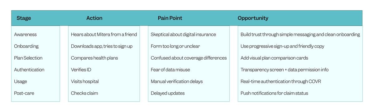
Adaora's journey moves through six stages: awareness, onboarding, plan selection, authentication, hospital usage, and post-care claims. At nearly every stage, the existing system introduced doubt. Each friction point became a design opportunity.
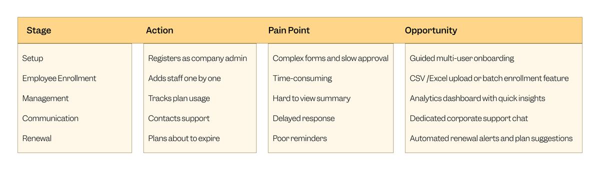
Kunle's journey follows a parallel but distinct path: company setup, employee enrolment, ongoing management, support communication, and plan renewal. His pain points centre on complexity and scale.
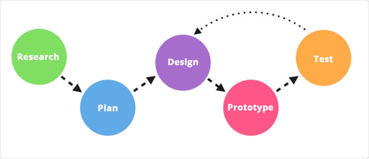
The project followed an iterative cycle. Research and planning established the problem space and user needs. Design moved through low-fidelity sketches and wireframes before progressing to high-fidelity screens. Prototyping and testing validated decisions at each stage, with continuous refinement based on user feedback.
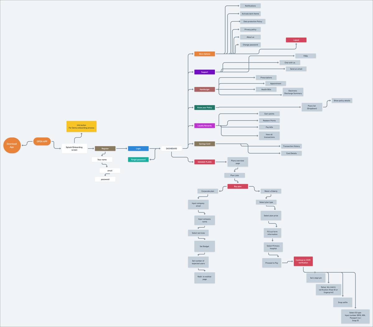
With the journey maps as a foundation, a comprehensive user flow was created to chart every path through the application: from downloading and onboarding, through registration and plan selection, to managing policies, scheduling appointments, accessing loyalty rewards, and reaching support.
Exploration began on paper. Rough wireframes established the layout, hierarchy, and interaction patterns for core screens. Working at low fidelity kept the focus on structure and flow rather than visual detail, making it faster to test ideas, discard what did not work, and iterate toward solutions that felt intuitive.

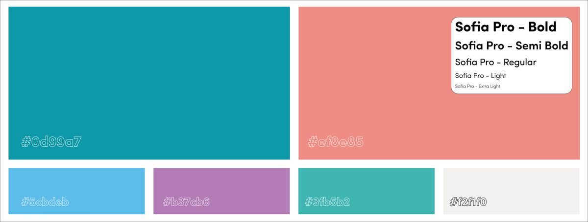
The visual language draws from Mitera Health's existing brand palette. Teal serves as the primary colour, carrying the brand's associations with trust, health, and calm authority. A warm coral acts as the secondary accent, adding approachability. Sofia Pro was selected as the typeface for its clarity and warmth, spanning multiple weights from Extra Light through Bold.
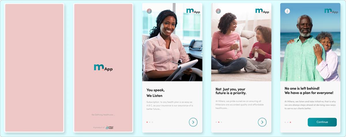
The onboarding sequence was shaped directly by Adaora's journey. Research showed that scepticism set in early, so the first three screens needed to communicate value quickly with simple, reassuring messaging rather than feature lists. An interactive guide walks first-time users through key actions.
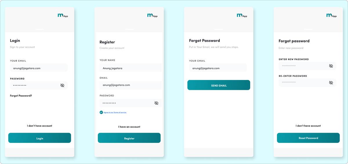
The sign-up flow addresses one of the clearest research findings: long forms kill momentum. Registration captures only what is essential to get started: name, email, and password. Sensitive personal and medical information is collected later, within secured flows, rather than at the point of registration.
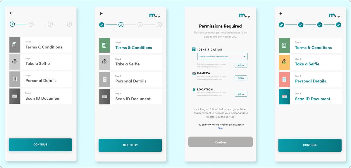
Rather than bundling consent requests into a wall of text, the app presents a clear, step-by-step verification sequence: terms and conditions, selfie capture, personal details entry, and ID document scanning. A dedicated transparency screen explains exactly what data is collected and why. Progress indicators show where the user is in the process, reducing anxiety around a flow that asks for sensitive information.
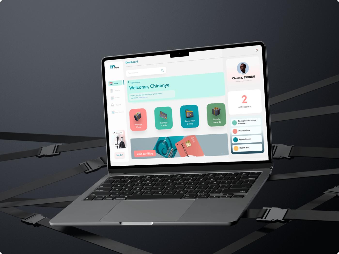
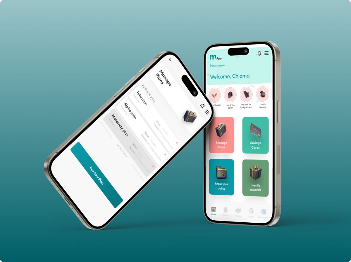
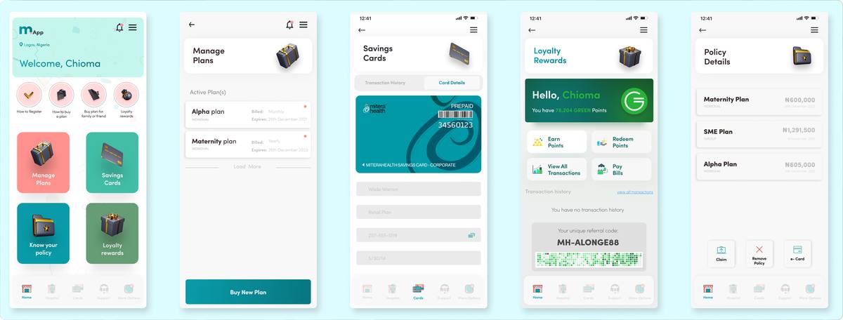
The main dashboard surfaces the most important actions immediately: quick access to benefits, plan management, savings cards, policy information, and loyalty rewards. Navigation is kept flat and visible, with a bottom tab bar ensuring that core destinations are never more than one tap away.
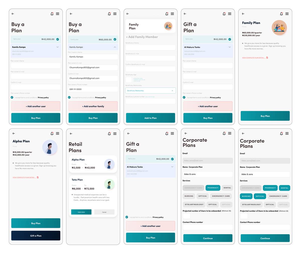
Users can browse and purchase plans for individuals, families, SMEs, and corporate groups through a flow that uses visual comparison cards to make coverage differences immediately clear. The purchase sequence guides users through plan selection, detail entry, hospital selection, and payment in a linear progression. For corporate users, the system supports batch enrolment.
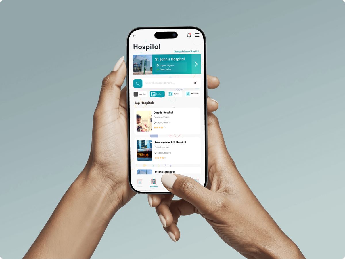
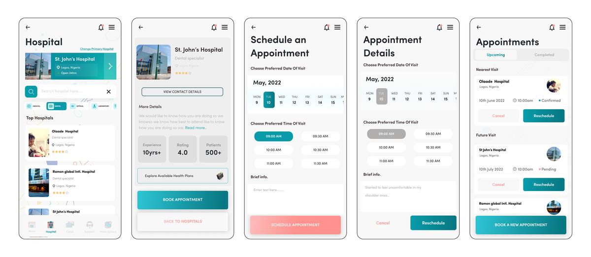
Once enrolled, users can select hospitals within their plan network, schedule appointments directly through the app, and connect with doctors faster than walking into a facility in person. The appointment scheduling interface uses a calendar-based picker with available time slots. Real-time COVR authentication replaces the manual verification that hospital staff had identified as a major bottleneck.
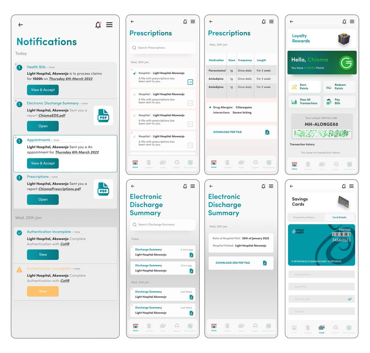
The app extends into ongoing health management. Users can receive prescriptions from their doctors without visiting a hospital, view electronic discharge summaries, track their health ID and COVR verification status, manage notifications, and access support through FAQs, live chat, or email. Push notifications keep users informed about claim status. A dark mode option provides visual comfort.
The final product is a comprehensive health insurance platform that takes a traditionally cumbersome process and makes it feel effortless. Every design decision traces back to what the research revealed: that the barriers to health insurance adoption in Nigeria are not just financial, they are experiential.
The COVR verification system adds a layer of fraud prevention that protects both the insurer and the insured. The loyalty rewards programme incentivises ongoing engagement. And the corporate tools give HR managers the visibility and efficiency they had been missing entirely.
mApp is available on the Google Play Store, the App Store, and the Huawei Store.
View Prototype →