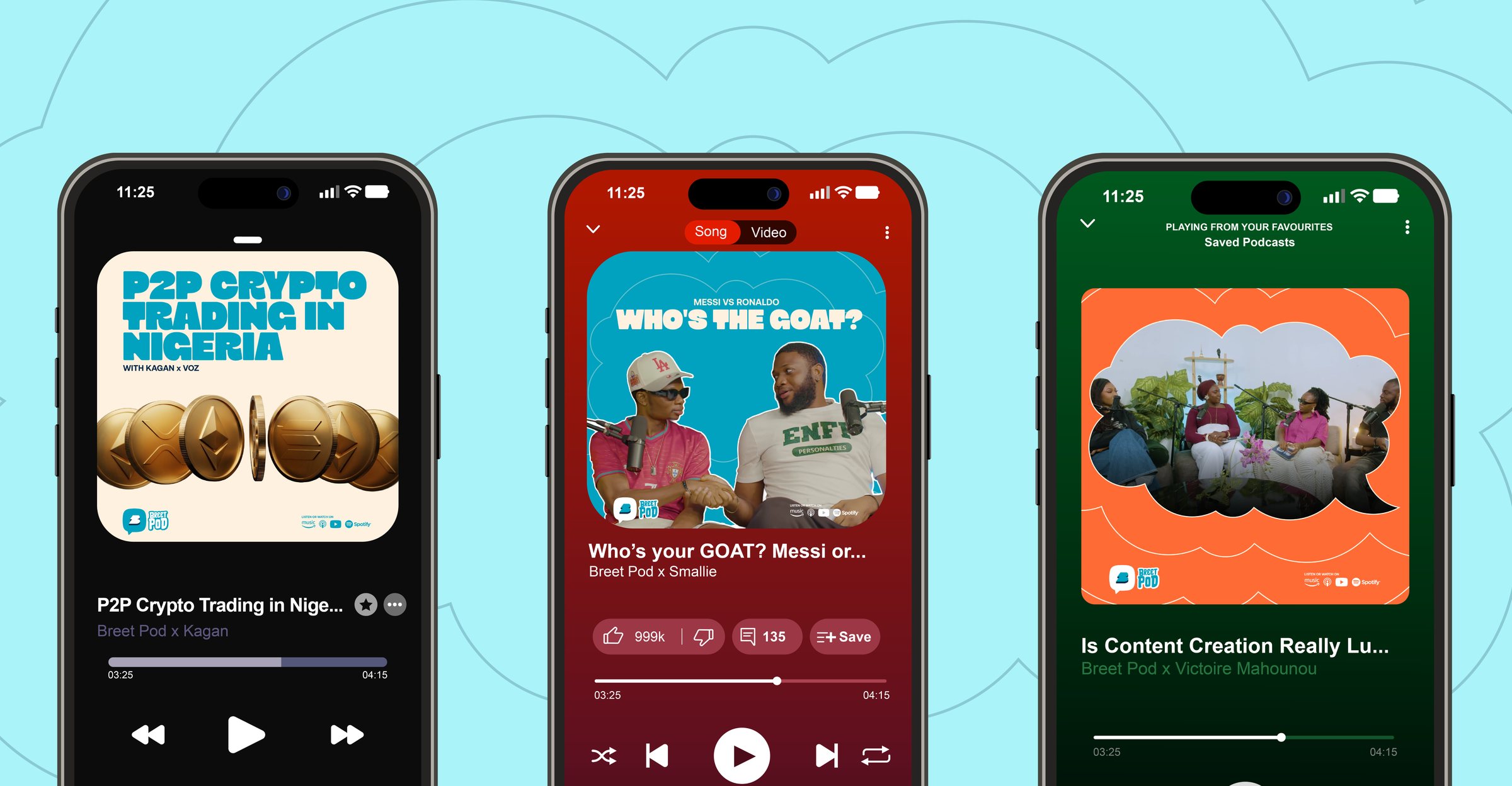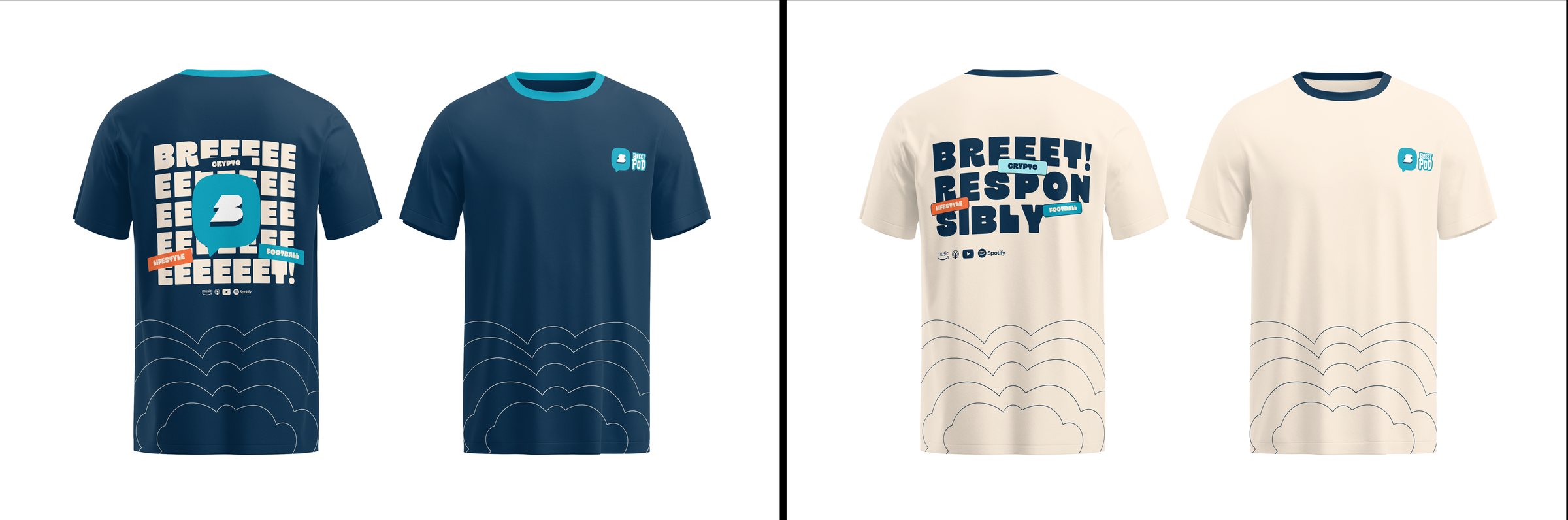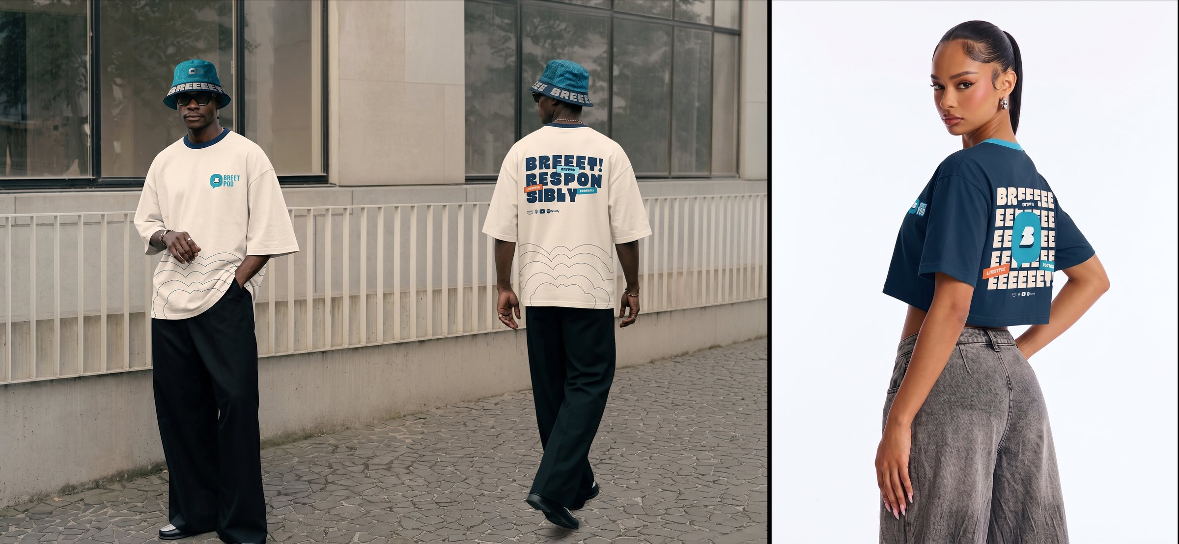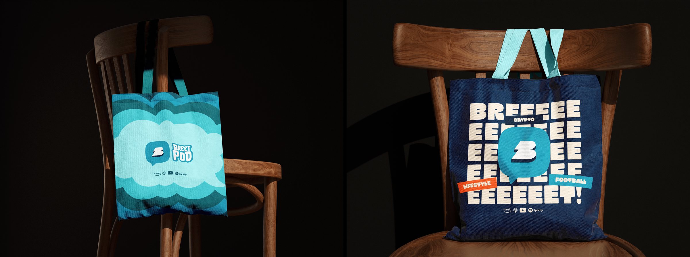
Breet Pod is a dynamic discussion series powered by Breet, Africa's leading crypto-to-cash app. Built for the tech-savvy generation, it explores the intersection of lifestyle, modern finance and pop culture. Through engaging debates and authentic storytelling, Breet Pod gives Nigerian and African voices a platform to discuss everything from financial literacy to trending social commentary.
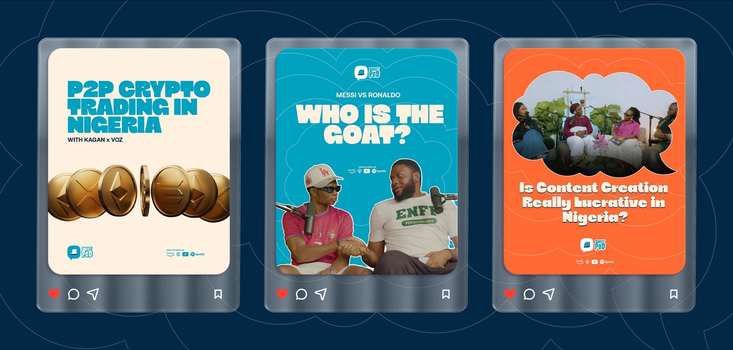
As a visual brand, Breet Pod steps away from sterile corporate media. It embraces a bold, fast-paced, community-centric aesthetic that matches the energy of its Gen Z and younger millennial audience. The design ecosystem relies on striking visual contrast, vibrant motion and highly scannable layouts, so every episode feels less like a broadcast and more like an authentic, premium hangout.
Every good gist starts from one point: a thought, which becomes a question, and in the end, a hot take. The Pulse pattern captures that moment. Chat bubbles expand outward from a single centre in steady, rhythmic rings, the way a heartbeat registers on a monitor.
The centre is the heart of the conversation, and each ring is that conversation growing, being shared and reaching further. The rhythm is deliberate. The pulse mirrors a breath: a steady expansion outward, like an exhale (a Breet). That ties the motion directly to the Breet name and to what the podcast offers, a calm, measured space to talk through a market that rarely slows down.
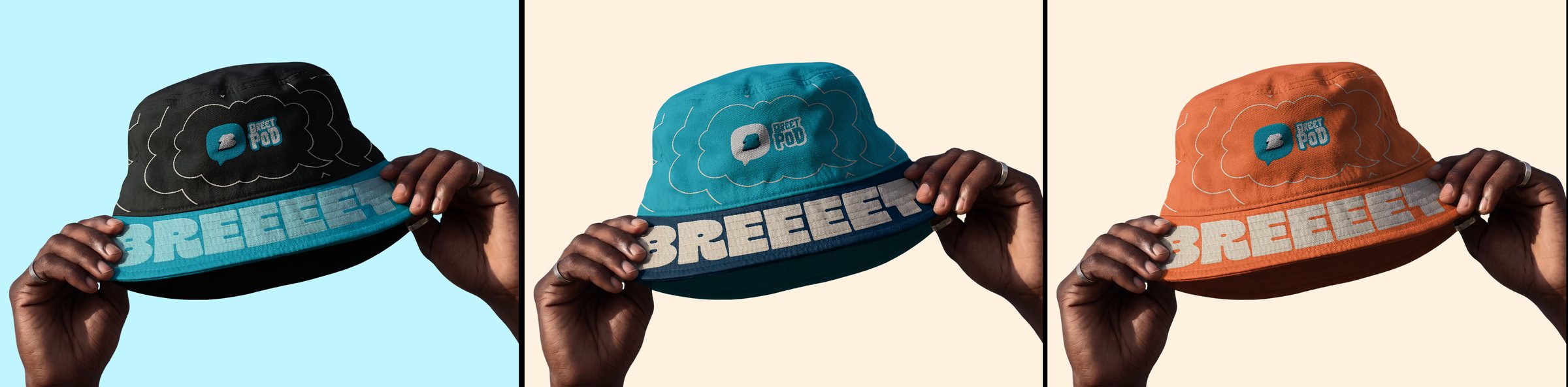
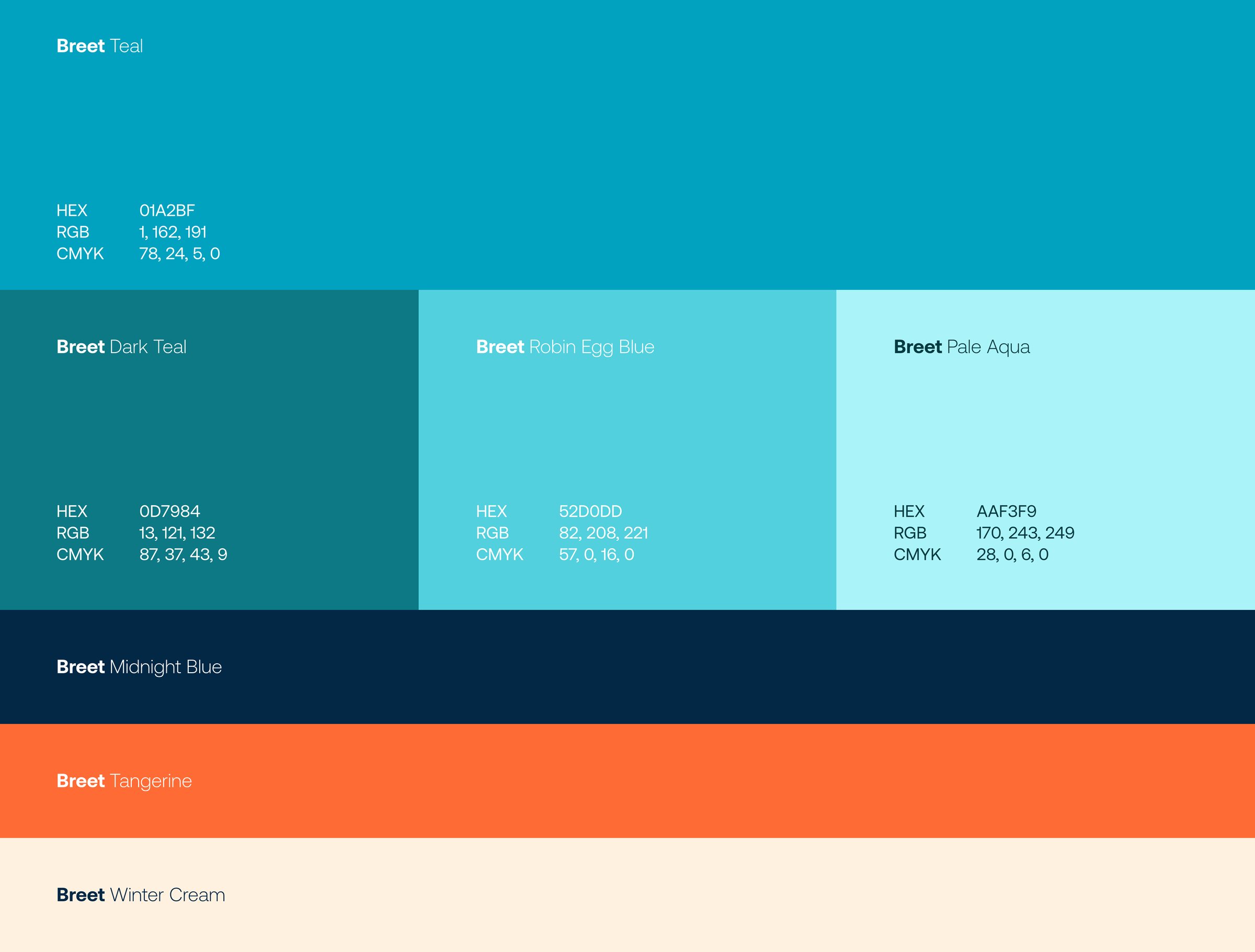
The palette is built on vibrancy. It carries the energy of a brand speaking to an audience that is digital, expressive and quick to engage with brands that feel confident and alive. It is anchored in the Breet teal family, keeping the podcast visibly connected to the parent brand, then extended with warmer, higher-contrast accents that give the identity room to be bold and conversational. Together, the colours strike a deliberate balance between energy and credibility.
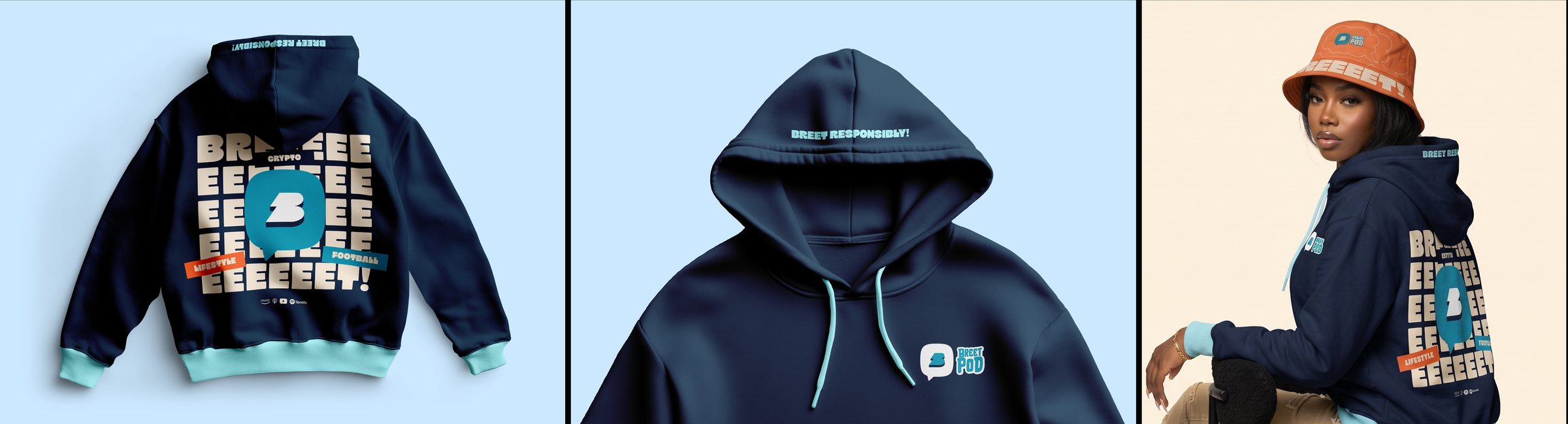
Breet Teal is the primary colour and the most recognisable link to Breet. It leads across all touchpoints and is tied to content around the sports side of the podcast. Dark Teal adds depth and structure for layering and moments that need more weight. Robin Egg Blue and Pale Aqua soften compositions and create the layered cloud effect, giving the palette an airy, breathable quality: a quiet nod to the Breet name.
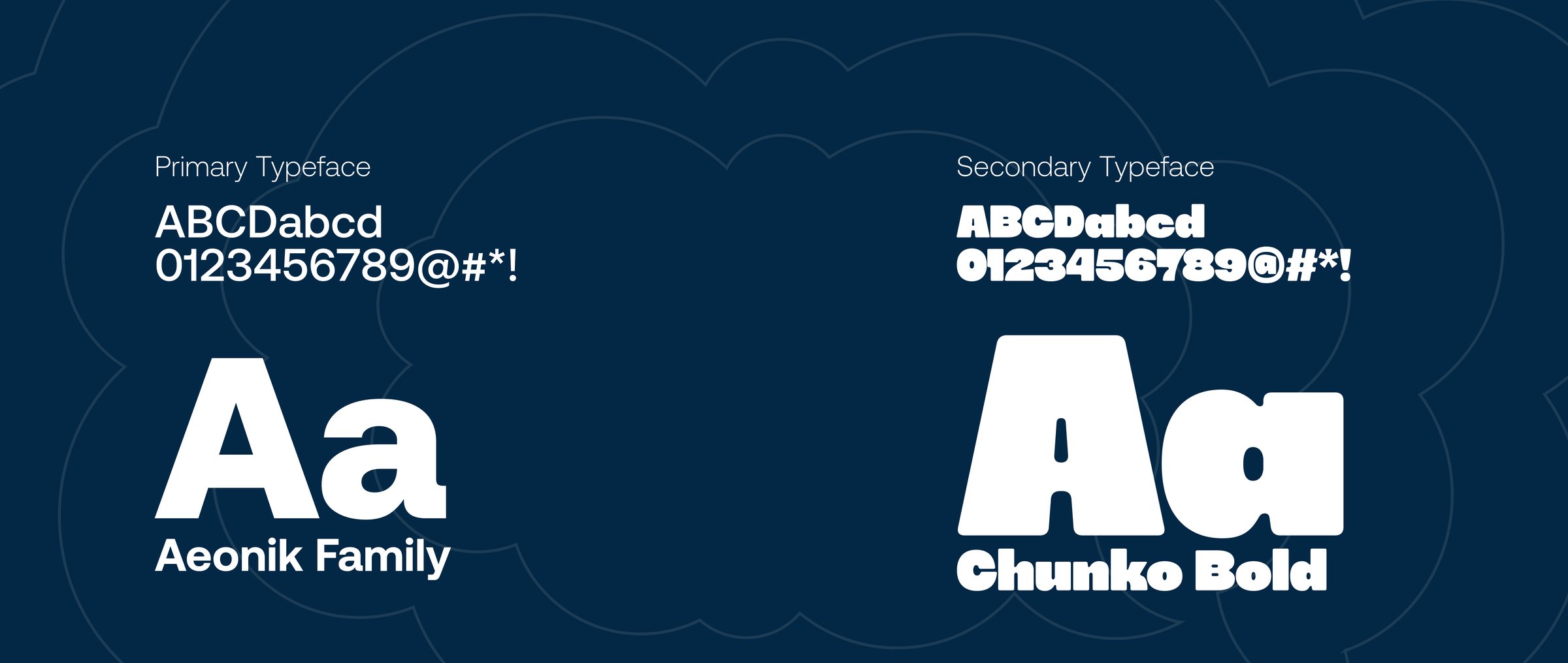
Midnight Blue grounds the system, carrying typography and the seriousness and trust a financial brand needs. Tangerine, the complement to teal, is the energy accent, reserved for highlights, calls to action and lifestyle content where its loud, notice-me energy belongs. Winter Cream is a warm neutral, softer than pure white, and is tied to the crypto side of the podcast so that this content feels approachable, which in turn shapes how people feel about Breet as a brand.